Showing posts with label Crush. Show all posts

Monday 6 January 2020

Honest Menus

When Tom and Phil set up Honest Burgers in Brixton in 2011, they had a single goal: do fresh, high-quality British burgers and do them well. Since then, they've stayed true to that goal and even opened their own butchery. Honest Burgers now have 36 restaurants throughout the UK, plus a field kitchen for festivals and events. Honest Burgers produce beautifully designed print items - not lavish, just functional, well considered and produced - and sometimes quirky! ...like the wonderful Meat & Potatoes publication that I wrote about here.

Below are the printed menus used at their restaurants. Size is 240x160mm and they are printed offset litho in one colour. They are drilled with two holes which are used to hold them onto boards with fixings. There are separate menus for burgers and drinks... 
The menus are printed on our Crush range from Favini. The burger menu (above) is printed on Crush Kiwi 120gsm and the drinks menu (below) is printed on Crush Citrus 120gsm. If you are not aware of the range, it is very unusual! The paper is made partly using the residues from agro-industrial food processing which are "end of life" products replacing up to 15% of conventional tree pulp and are combined with 40% post-consumer recycled waste and the remainder is FSC virgin fibre. The range is produced with 100% green energy.
...the sheet is not a "clean" paper, it has identifiable pieces of residue visibly in the paper, as you can see from the detail image below...
The menus are printed offset litho and design is by Connie Barton at Studio Connie. Yet another example of a well considered piece of print where the simplicity of design, materials and processes are just right.

https://www.honestburgers.co.uk/
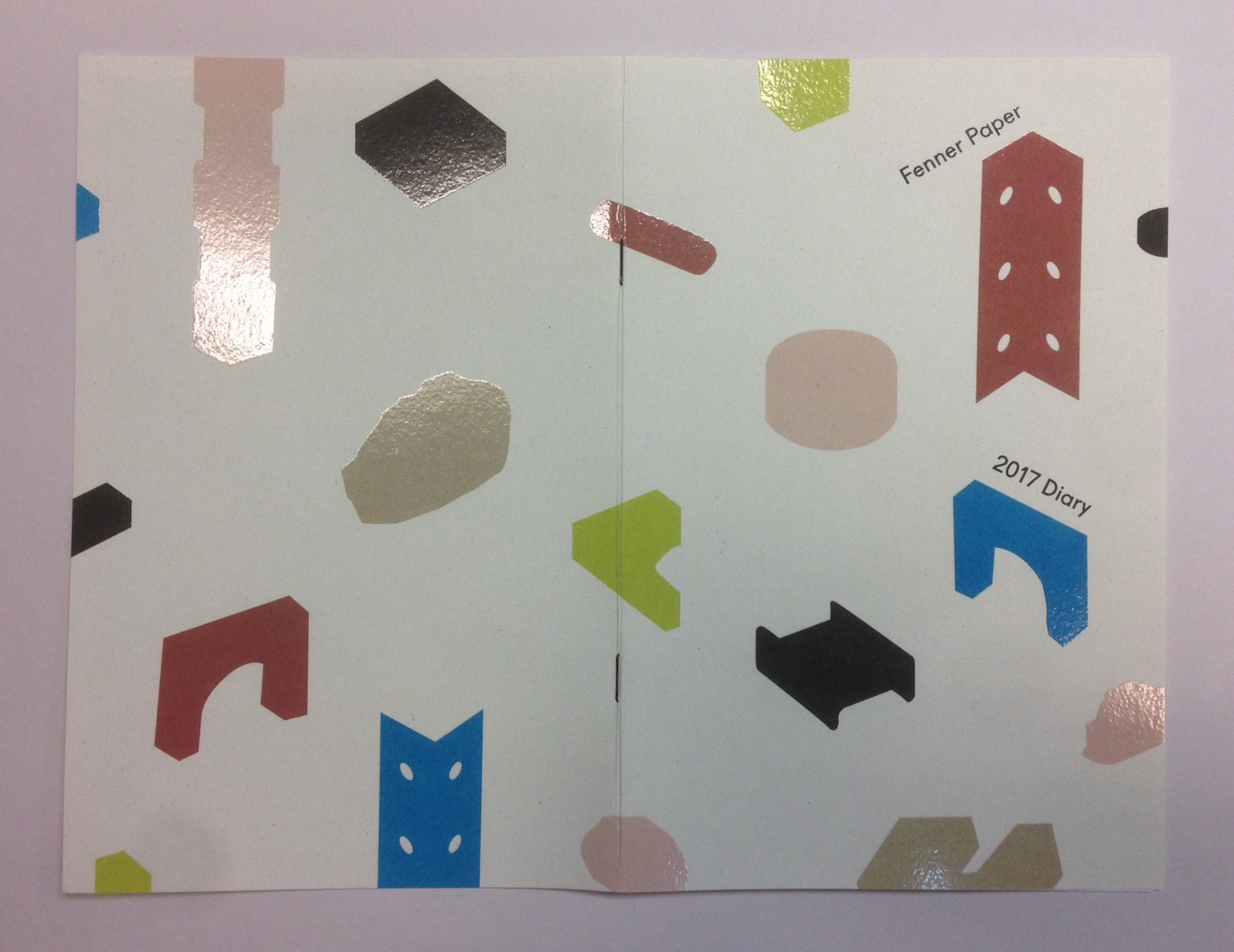
https://www.studioconnie.com/
Posted by Justin Hobson 06.01.2019

Thursday 31 January 2019

Archerfield Gift Voucher

Fletcher’s Cottage Spa is the luxurious spa set on the Archerfield Estate, which is less than an hour from Edinburgh. The estate features a golf course and several houses which can be booked in their entirety for weddings and celebrations. The spa has been featured in the Sunday Times Travel Top 6 British Spas and the Tatler Spa Guide.
This is the printed gift voucher, the format is a 6pp, A4 gatefold with two "thumbcuts" which hold in the voucher (195x92mm) as you can see in the images below.
Click on images to emlarge
The below image shows the outer cover, flat.
This literature is all printed on Crush, Corn 200gsm. It has been digitally printed (beautifully) on a Ricoh 5100 by DTP Print in Edinburgh as you can see from the detail image below...
Creative direction and design is by Katherine Scott at Studio Thought Process based in Edinburgh.
 
If you aren't familiar with Crush, it is one of our ranges made by FAVINI in Italy and is made using 15% residues from the industrial processing of agricultural processing. As a result, the paper does have inclusions and a "rustic" feel, which you might just be able to see from the image detail below:
Click on images to enlarge
With thanks to Sonya Beaumont at DTP Print for sending file copies.

https://www.archerfieldhouse.com/spa/
http://studiothoughtprocess.com/
http://www.dtpprint.co.uk/
Posted by Justin Hobson 31.01.2019

Tuesday 20 March 2018

Fletcher's Cottage Spa

Fletcher’s Cottage Spa is the luxurious spa set on the Archerfield Estate, which is less than an hour from Edinburgh. The estate features a golf course and several houses which can be booked in their entirety for weddings and celebrations. The spa has been featured in the Sunday Times Travel Top 6 British Spas and the Tatler Spa Guide.

This is the pocket menu, which lists the stunning array of massages and treatments available.
The format is a 14pp, long concertina, held together with a 'belly band'. The finished size is 145mm x 100mm, folding out to 145mm x 980mm.
The birdseye view below shows how it works...
Click on images to enlarge
Above shows the front cover. The clever way this concertina format works, means that you can view it in spreads, as you can see below....
The 14pp concertina is printed on Crush, Corn 200gsm and the bellyband is printed on Crush Coffee 250gsm, which are a perfect combination.
Click on images to enlarge
Below shows the whole publication spread out, so you can see both sides:
Now one of the important things to point out is that this publication is printed digitally ...yes, even though it's 980mm long! It is printed on a Ricoh 5100 by DTP Print in Edinburgh and they have not only made an excellent job of the printing, there are a couple of other details that are worth pointing out too. The belly band is 45mm wide. The icon is beautifully die cut and it registers right over the printed icon ...just perfect!
Also, most bellybands are glued or stuck with a sticker, which makes them impossible to replace! ...however this band has a clever and well fitting die cut semi circle and slit, which works perfectly.
Creative direction and design is by Katherine Scott at Studio Thought Process based in Edinburgh.
 
If you aren't familiar with Crush, it is one of our ranges made by FAVINI in Italy and is made using 15% residues from the industrial processing of agricultural processing. As a result, the paper does have inclusions and a "rustic" feel, which you might just be able to see from the image detail below:
Click on images to enlarge
With thanks to Sonya Beaumont at DTP Print for sending me file copies.

https://www.archerfieldhouse.com/spa/
http://studiothoughtprocess.com/
http://www.dtpprint.co.uk/
Posted by Justin Hobson 20.03.2018

Thursday 15 December 2016

Fenner Paper 2017 Diary

If you are a wonderful customer and therefore a deserving user of our papers! ... you should have already received your new 2017 diary in the post. Here's a sneak preview, if you haven't yet received it.
 As in previous years, the diary is 230x162mm, portrait and retains the popular 'month to view' format. The cover board is printed offset in CMYK on Crush Corn 250gsm.
The 40pp text is simply printed in one colour, offset litho, on our lovely Offenbach Bible 60gsm, which has a superb opacity and a good writing surface making this an ideal paper for a diary or notebook.
 
The cover is designed by FranklinTill Studio celebrating the maker movement and using a palette of colours forecasted for the year.
Inside back cover
My thanks to FranklinTill for the inspired cover.
Posted by Justin Hobson 15.12..2016


Thursday 8 December 2016

LCC Postgraduate Show

The identity for this year's LCC degree shows is by Tara Hanrahan at Think/Do, which includes interior signage, exterior signage, wayfinding and literature. This week is the postgraduate show, with over 200 post graduate students showing their work. The Postgraduate shows run from 28.11.2016 to 10.12.2016.
The printed collateral includes this postgraduate information booklet. Size is A5 (210x148mm), portrait and is saddle stitched.
The 4pp cover is on Colorset (100% Recycled) Amethyst 270gsm, printed offset litho in black only
 
 The 8pp text is printed on Crush, Grape 120gsm, printed in two colours, black and a special colour.
Click on images to enlarge
If you are not aware of our range called CRUSH from Favini, it is very unusual! The paper is made partly using the residue from the industrial processing of crushed citrus fruit, coffee, nuts, olives, kiwi, corn, cherries, lavender and most recently grape. These agro-industrial "end of life" products replace up to 15% of conventional tree pulp and are combined 30% post-consumer recycled waste, FSC virgin fibre and is produced with 100% green energy. As a result, the sheet is not a "clean" paper, it has identifiable pieces of residue visibly in the paper, as you can see below...
The range is available in 100, 120, 200, 250 and 350gsm and the shades are natural, earthy tones and the feel of the paper is natural and tactile. See the range here.

Printing is by Calverts, who are a London based printing cooperative who focus on sustainable printing. Another lovely feature, is the use of the black wire stitches below:
Sustainability is an important facet to Tara's practice, which accounts for the selection of these sustainable papers and printer. You can read more about the identity work here:
http://blogs.arts.ac.uk/london-college-of-communication/2016/05/20/interview-tara-hanrahan-on-designing-for-lcc-degree-shows-2016/
Thanks to Tara for sending file copies and the note.
http://www.arts.ac.uk/lcc/events/lcc-postgraduate-shows-2016/
Posted by Justin Hobson 08.12.2016

Wednesday 9 November 2016

LCC Degree Show Book

The identity for this year's LCC degree shows is by Tara Hanrahan at Think/Do, which includes interior signage, exterior signage, wayfinding and literature. With over 700 graduating students showing a diverse range of work, it is a serious challenge for any identity to encompass the breadth of what is on offer. You can read more about the identity work here:
http://blogs.arts.ac.uk/london-college-of-communication/2016/05/20/interview-tara-hanrahan-on-designing-for-lcc-degree-shows-2016/

The printed collateral includes this information booklet. Size is A5 (210x148mm), portrait and is saddle stitched.
The 4pp cover is on Colorset (100% Recycled) Lemon 270gsm, printed offset litho in black only.
The 8pp text is printed on Crush, Kiwi 120gsm, printed in two colours, black and a special colour.
If you are not aware of our range called CRUSH from Favini, it is very unusual! The paper is made partly using the residue from the industrial processing of crushed citrus fruit, coffee, nuts, olives, kiwi, corn, cherries, lavender and most recently grape. These agro-industrial "end of life" products replace up to 15% of conventional tree pulp and are combined 30% post-consumer recycled waste, FSC virgin fibre and is produced with 100% green energy. As a result, the sheet is not a "clean" paper, it has identifiable pieces of residue visibly in the paper, as you can see below...
The range is available in 100, 120, 200, 250 and 350gsm and the shades are natural, earthy tones and the feel of the paper is natural and tactile. See the range here.

Printing is by Calverts, who are a London based printing cooperative who focus on sustainable printing. Another lovely design and print touch, is the use of the black wire stitches (staples) below:
Sustainability is an important facet to Tara's practice, which accounts for the selection of these sustainable papers and printer. Thanks to Tara for sending file copies (and the note) and also for supplying me with images of the book.
Posted by Justin Hobson 09.11.2016


Monday 6 June 2016

Launch of International competition....

The Istituzione Bevilacqua La Masa and Italian papermakers Favini have announced the International Competition of Illustration and Social Graphics “Societies on the Move” which aims to stimulate the artistic imagination of cosmopolitan and multi-ethnic views of our society.

Nowadays, the movement of people and populations imposes increasing challenges on contemporary society: the use of common resources and rights is challenged by new needs to share, while an active and informed citizenship is required with regard to the environment, consumer choices, and the dynamics of production and institutional processes.

The creation of future societies can also start from a vision. The call is aimed at graphic artists and illustrators, with no limit on age or nationality, and both individuals and groups can participate. Participants are asked to create an original illustration or a graphical interpretation of the theme indicated.

A qualified jury will select the best works to be printed and displayed to the public in an exhibition at the Galleria in Piazza San Marco of the Bevilacqua La Masa Institution in Venice, from 20 October to 20 November 2016.

Moreover, the winner will receive a cash prize!

The selected works and the winner will be featured in the catalogue dedicated to the exhibition. An important factor is that there is no entry fee. The entrants may optionally decide on which type of paper produced by Favini to print the image they submit, especially on the lines Crush and Remake, although this is not compulsory.

Entries will be assessed by a qualified jury made up of international experts in the field of illustration, arts and visual communication. The five jurors for the prize will be: Giorgio Camuffo, Cedar Lewisohn, Riccardo Falcinelli, Steven Guarnaccia, and Hamelin Associazione Culturale.

Favini will also identify twelve images, independently from the jury’s decision, to use to create a calendar for the year 2017.

The application deadline is 25th August 2016. The call to competition can be downloaded here:

It would be lovely to see some UK entries, so please go on and HAVE A GO ...!

Posted by Justin Hobson 06.06.2016