Wednesday 30 December 2015

Simon Winnall

Simon Winnall is an advertising photographer, specialising in lifestyle and portraiture work for brands and ad agencies across the world. Here are just some of the names he has worked with: BMW Coca-Cola DHL Honda LG Nescafé Nivea Oriflame Panasonic SFR France Sony Vodafone Volvo BBH Brave DDB Huge Inc Leg Paris Leo Burnett McCann Erickson Nexus/H Ogilvy Sapient Nitro VML Sao Paulo ...and the list goes on!
 
This piece of promotional print is to show new work and it is a particularly engaging piece of print. The size is 150mmx 200mm, landscape format. There is a 4pp cover which is unprinted, just simply debossed with his name on or Colorset 100% Recycled Light Grey 270gsm.
The 16pp text is 'singer sewn' in a bright red thread - beautiful detailing.
The text is printed Offset Litho on our Omnia White 150gsm, the results of which are superb. The look and feel of the whole publication is very uncoated and tactile but there is absolutely no loss of detail in the images.
Click on images to enlarge
The spreads look superb with the mono images in particular, really rocking:
Image showing inside detailing of the singer sewing:
Photography, design and production is by Simmon Winnall. Superb print is by London based printer Push.

http://www.simonwinnall.com/
www.processphotography.com
http://www.push-print.com/
Posted by Justin Hobson 30.12.2015

Monday 28 December 2015

Christmas card by S-T

Thank you to everyone who has kindly sent me cards this Christmas. I've received a wide selection of really lovely designs and beautifully produced cards, not all on our paper, of course! ...but many are.
 
This one particular card, I did think I would write about, because not only is it printed on our Colorset Bright Red 270gsm (100% Recycled) but it is printed in an unconventional way. The card is designed by London based studio, Design by St. The size of the card is A6 (105x148mm) landscape format and is hinged at the top of the card.
Click on images to enlarge
The card is printed in just one colour - white. The result is fantastically effective and I looked at it to see how it has been achieved:
Was it matt hot foil blocking? Silkscreen? HP Indigo digital white?
...Nope, none of the above!
In fact, it was printed by a Scottish printer called Kestrel Press based in Irvine. They have a digital press which is toner based and this is the result - in just one pass! The result is truly superb and as I discovered from speaking to Graeme Ferguson at Kestrel, achieved at a much more economical price in comparison with the processes I listed above.
Creative Partners at Design by St are Steve Fenn and Tom Pollard.

http://www.designbyst.com/
http://www.kestrelpress.com/
Posted by Justin Hobson 28.12.2015

Wednesday 23 December 2015

Fenner Paper 2016 Diary

If you are a wonderful customer and therefore a deserving user of our papers, you should have already received your new 2016 diary in the post, here's a sneak preview, if you haven't yet received it.
As in previous years, the diary is 230x162mm, portrait and retains the popular 'month to view' format. The cover board is printed offset in just one colour on our new Zanders Zeta Linen 270gsm.
 
The 40pp text is simply printed in one colour, offset litho, on our lovely Redeem 100% Recycled 60gsm, which has a superb opacity and a good writing surface making this an ideal paper for a diary or notebook.
 
The 'tent' calendar is printed on Zanders Zeta Hammer 270gsm and should be a useful addition to any desk! Our thanks go to the Reflex Paper Mill for supplying us with the material for the diary cover and calendar.
 
If you aren't a user of our papers and just fancy one anyway! ...they are available for purchase, just e-mail me for prices.

justin@fennerpaper.co.uk
Posted by Justin Hobson 23.12..2016

Monday 21 December 2015

Waddesdon Wine - Bottle wrap

Waddesdon Manor is the historical country seat of the Rothschild family in Buckinghamshire and home to Waddesdon Wine, the official distributor for the Rothschild collection of wines.
This branding project includes a bottle wrap, printed using reproduction maps of the vineyard areas. The material used is our Offenbach Bible 40gsm, which is light enough to be used as a lightweight, 'tissue' type wrapping material and yet can still be printed offset litho in four colour process. Here is the final result, wrapped around the bottles...

The identity for Waddesdon Wine was created by Paul Belford Ltd and includes a wide range of printed collateral, including boxes and a brochure and features this W device.

Design and photography is by Paul Belford Ltd with creative direction and photography by Paul Belford and Martin Brown. The Offenbach Bible 40gsm is printed offset litho in CMYK by Identity.

http://www.waddesdon.org.uk/
www.paulbelford.com
http://www.identityprint.co.uk/
Posted by Justin Hobson 21.12.2015

Friday 18 December 2015

Alfred & Wilde

Alfred & Wilde is an East-London based design brand producing art prints, stationery and homewares featuring bold metallics and cool graphics. Founded by artist and designer Simon Mitchell in 2013, Alfred & Wilde draw inspiration from the architecture and history of London (and beyond), using geometric shapes and typography to create beautiful printed designs.  All products are designed with heart in their East London studio.

These distinctive and fun Christmas cards are produced in conjunction with the Science Museum. Size is 170x120mm and they are printed on our Colorset 100% Recycled 270gsm.
Click on images to enlarge
The cards are printed on Colorset Bright Red and Natural 270gsm. They are printed using a combination of digital print using an HP Indigo Press plus hot foil blocking by specialist greeting card printers, The Imaging Centre. Unusually for a print company, they have hot foil blocking in -house.
As well as the Science Museum, you can find Alfred & Wilde at good design stores and independent boutiques across London and Europe. Throughout the year you may also spot them at selected markets and shopping events, particularly in East London.

http://www.alfredandwilde.co.uk/
http://www.sciencemuseum.org.uk/
www.theimagingcentre.co.uk
Posted by Justin Hobson 18.12.2015

Wednesday 16 December 2015

What is ...the correct size for a business card?

What is ...Number 24
Regular followers of this blog will know that in the middle of the month, I publish a "What is ....? post. The article covers various aspects of paper, printing and finishing in greater depth. However, many of these subjects are complex, so these posts are only intended to be a brief introduction to the topic.

What is ...the correct size for a business card?

Business cards developed from the calling card, which became an important part of 18the, 19th and 20th century social etiquette. Originally the footmen of aristocrats would present a visiting card to the servant of their prospective hosts, thereby introducing the arrival of their owners.

Today, with relatively little business correspondence (on letterhead paper) the business card is one of the most visible pieces of business communication. However regarding the size, there is convention, but no actual rules! Sizes vary internationally and obviously there are cultural norms which certain markets follow.

In the UK the accepted size for business cards is 55x85mm. In the US it is based around 2inches x 3.5inches, which equates to a slightly larger 51x89mm. Other sizes around the world seem to vary from 55x90mm to 50x90mm and in Japan where the business card, called a Meishi (名刺?) has an extraordinary cultural significance, the size is 55x91mm.

I measured the card, here at the hotel in Penang, Malaysia and the size is 56x89mm ...different again!
So there you have it, no right or wrong size, just some local sizes to be aware of.

Posted by Justin Hobson 16.12.2015

Tuesday 15 December 2015

Wansbrough Paper Mill to close

A fortnight ago, it was confirmed that Wansbrough Paper Mill, located in Watchet, Somerset will close athis Christmas with the loss of 176 jobs. The mill is owned by paper and packaging conglomerate DS Smith, who regard production at the site not to be commercially viable.
Photo courtesy of DS Smith
I don't just write about events such as this just to spread doom and gloom! ..it's just that most people in the design and creative print market often don't hear about these events and I think it's important, from an industry perspective, that it is reported. Unfortunately the world of paper manufacturing is not in a great shape, especially not in European countries, where energy prices and high production costs make it hard for any 'heavy' industry to survive. One only has to think of the recent media coverage about closures in the UK steel industry.

Previously I have written on this blog about a paper mill that has been turned into a Google data farm:
http://justinsamazingworldatfennerpaper.blogspot.co.uk/2014/03/from-paper-mill-to-shopping-mall.html
...and a paper mill that is now a shopping mall:
http://justinsamazingworldatfennerpaper.blogspot.co.uk/2013/01/from-paper-to-data.html
...on a positive note, I've also written about a new mill that started production in the UK in 2009:
http://justinsamazingworldatfennerpaper.blogspot.co.uk/2009/09/paper-mill-actually-opens-in-uk.html

Photo courtesy of DS Smith
Wansbrough Mill, is located in picturesque Watchet in Somerset and currently the largest manufacturer of coreboard in the United Kingdom. It also produces recycled liner as well as envelope and bag Papers. The total annual production capacity of the mill is around 180,000 metric tonnes. The mill was founded in 1750 by William Wood and was taken over by the Wansbrough family in 1846, who installed paper machines. The site went on to become a profitable business which was later acquired by DS Smith in 1986.

DS Smith has confirmed that the historic mill will close, resulting in 176 job losses, on Christmas Eve.
http://www.dssmith.com/
Posted by Justin Hobson 15.12.2015

Thursday 10 December 2015

Aaaaaaaah! film poster

This is the promotional poster for Steve Oram's directorial feature debut, Aaaaaaaah! (that's eight "A's"). The film has been written and directed by Steve Oram and the cast includes Julian Barratt, Toyah Wilcox, Julian Rhind Tutt and Holli Dempsey.

This poster is A2 size (594x420mm) and is silk-screen printed in six colours, a combination of tonal work and solid colours - the zip is printed in shiny metallic silver. It is produced using our Colorset, Bright Red 270gsm.
The posters were printed to coincide with the film's premiere in Leicester Square as part of Frightfest 2015. More information on the film can be found at both the Rook Films and Lincoln Studios sites. You can see the trailer below...
There is a review of the film here: http://www.theguardian.com/film/2015/sep/10/aaaaaaaah-review-satire-of-beastly-behaviour
The prints were screen-printed by Gary Parselle at Brighton based silkscreen studio, The Private Press, and the above picture is from from the studio when they were in the drying rack.
 
Design is by Jay Shaw. Above is a picture of Steve Oram and Holli Dempsey pictured with the poster at the premiere!

Posted by Justin Hobson 10.12.2015

Tuesday 8 December 2015

Caramel Baby & Child Christmas

This is the look-book for last the last Christmas collection for Caramel Baby & Child . The format is a very simple 4pp broadsheet, opening to a large size. The open size is 420x556mm, folded to 420x278mm, which is then 'endorsement' folded to 210x278mm.

like so....
Click on images to enlarge
folding out to...
The wonderful little Christmas illustrations (left) just work perfectly with the images.

Like many of the projects I feature, it is virtually impossible to do justice to the finished piece on this blog. Redeem 100% recycled is at best, off white and 100% recycled and 80gsm, so the feel that the paper exudes is one of simplicity and a 'newsy freshness'. The reproduction on this paper is superb, with even the intricate detail in the silhouettes and distinctive colours looking brilliant.
It is printed on Redeem 100% Recycled 80gsm, offset litho in four colour process (CMYK) plus a fluorescent orange on one side only. Print is by Blackwing Press.
Art direction and design is by the in house studio at Caramel Baby & Child. Designer on the project is Kelsey Hutchinson.

http://www.caramel-shop.co.uk/
http://www.blackwingpress.com/
Posted by Justin Hobson 08.12.2015

Thursday 3 December 2015

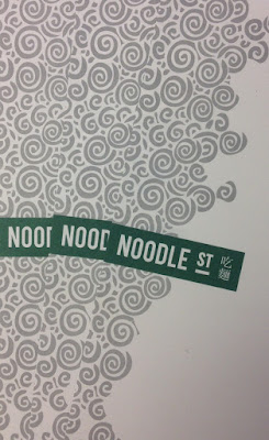
Noodle Street

Noodle Street is a traditional Chinese restaurant based in London's busy Canary Wharf. Established in 2010, Noodle Street prides itself of using the freshest ingredients and new dishes from the many and varied regions around China
The new identity has been applied to some swanky new A4 letterheads, printed on Shiro Echo, Bright White 120gsm.
Click on images to enlarge
The stationery is printed in two colours, offset litho. Shiro Echo is 100% Recycled (and FSC accredited) and part of the criteria for this project was that the paper should be recycled.
Detail of noodles!
Print is by Aldgate Press based in London.
Branding and design is by Reason. Design Director is Catherine Hampshire. Thanks to Catherine for sending me file copies and the nice words!
http://noodlestreet.co.uk/
http://www.reasondesign.co.uk/
http://www.aldgatepress.co.uk/
Posted by Justin Hobson 03.12.2015

Tuesday 1 December 2015

Jobs from the past - Number 74

Regular followers of this blog will know that my first post of every month is a "job from the past" so that I can show some of the really good work from years gone by...

Le Touessrok Brochure 2003
Located on the east coast of Mauritius in one of the island’s most spectacular bays, the Le Touessrok five-star resort is among the world’s most distinguished. It has three villas and 200 guestrooms and suites, all of which have sea views. Along with extensive water and land-based activities, it offers guests access to two islands: Ilot Mangenie, a private, secluded isle with 3.5 kilometres of pristine beach, and Ile aux Cerfs, where the 18-hole, par 72 championship golf course designed by Bernhard Langer is located - sounds perfect for Christmas!

As you can tell from the description above, this is anything but a normal resort and this is anything but a normal hotel brochure! It has a sense of scale and luxury that really has to be experienced to be truly appreciated and I'm afraid that it's unlikely that these images will do this project justice.
The size of the publication is 340x290mm, portrait and is a 32pp self cover. It is printed on our lightweight Offenbach Bible 60gsm and this brochure is undoubtedly one of the finest printed examples on Offenbach Bible that I have ever seen.
Above is the introduction spread, below, shows the way it the pages just beautifully flop over.
The cool grey, pantone special used on the cover runs throughout the brochure, between spreads, creating a perfect sense of pace and space, with captions. Below is ...so tropical
Click on images to enlarge
Design is by Pentagram. Creative director is John Rushworth and the designers on the project are Rob Duncan and Leigh Brownsword. The brochure is printed offset litho in four colour process plus a special grey and was printed by Gavin Martin Colournet.
Click on images to enlarge
...normally I do a "where are they now"? paragraph - as with many of these projects having been completed so long ago people and companies have often been scattered to the four winds! Not so in this case:
Rather fittingly for this article, the Le Touessrok resort (now the Shangri-La Le Touessrok Resort) reopened at the beginning of last month following a six month refurbishment. John Rushworth remains a partner at Pentagram in London. Rob Duncan now lives and works in San Francisco and is a partner at Mucho. Leigh Brownsword is a freelance design director based in London and Gary Bird is still merrily printing away at Gavin Martin Colournet!

www.letouessrokresort.com/
http://www.gavinmartincolournet.co.uk/
Posted by Justin Hobson 01.12.2015