Tuesday, 23 January 2018

Yateley Papers

Yateley Papers is a partnership between Trudi Savin and Sophie Morton. The business was born out of a shared passion for both traditional block printing techniques and a love of utterly gorgeous home, desk and stationery accessories. For 10 years Trudi ran the studio at Tobias and The Angel in Lingfield (Surrey) before establishing Yateley.

Yateley Papers produce stylish handmade desk stationery and home accessories all covered in their own bespoke designs inspired by their extensive experience of block printing on textiles. All products are made and hand prepared exclusively in Great Britain.

This is their set of five luxurious A6 notecards plus envelopes
The Yateley collections are all from patterns made using hand block printing, a careful balance of traditional techniques and modern technologies. These cards feature a blind embossed border (about 3mm wide). The printing is done using an HP Indigo press.
Click on images to enlarge
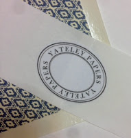
Accompanying the cards are these wonderful quality, diamond flap envelopes made using Zeta Hammer, Natural 120gsm (see below pic) which are lined envelopes  ...so the pattern you see printed in the image below is not printed on the inside of the envelopes but on a separate liner (printed on our StarFine) which is stuck inside the envelope. They are gorgeous.
Click on images to enlarge
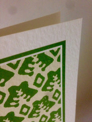
The cards are all printed on our Zeta Hammer, Natural 350gsm, which has a wonderful texture and is totally sympathetic to the block prints.
It is hard to photograph the texture of the cards, but I have done my best....
Click on images to enlarge
Reverse of the cards
http://www.yateleypapers.co.uk/
Posted by Justin Hobson 23.01. 2018

Saturday, 20 January 2018

Workshop at The Cass

Just before the Christmas holidays I was asked by Lecturer, Angharad Lewis, to run a workshop at The Sir John Cass School of Art (London Metropolitan University) known affectionately at the Cass.

The title of the workshop was: "Formats and materials for cost effective publications"

 I took the students through the briefest summary of papermaking and different types of materials and lead onto how papers are printed commercially and why it is the size of this machinery which dictates why materials are available in certain sizes and what the limiting factors are in producing publications.
Using interesting examples of commercially produced work, I demonstrated formats and how publications can be produced with an eye to economy. Using plain sheets of paper, I demonstrated how you can make an economical publication but with an interesting format. Using the information I told them about, I asked the group to use a single sheet of paper to explore their own formats and ideas.
It was a really interesting morning and I thoroughly enjoyed it. The students came up with some interesting ideas and formats - it's amazing what you can can achieve with a single sheet of paper.

My workshop was one of a number of workshops held that day. In the afternoon there were talks by a number of practising designers. I stayed to listen to the talk by Kate Moross.
Kate gave a very interesting talk about how to make a living as a designer. It was a really engaging talk and she gave some excellent advice.
http://www.londonmet.ac.uk/schools/the-cass/
https://www.studiomoross.com/
Posted by Justin Hobson 20.01.2018

Monday, 15 January 2018

The Disasters of Everyday Life

BlainSouthern is a contemporary art gallery with galleries in London and Berlin. It was started in September 2010 by Harry Blain and Graham Southern, who had sold their previous gallery, Haunch of Venison, to Christie's.

For their first exhibition with Blain|Southern, Jake and Dinos Chapman expand on their career-long preoccupation with Francisco Goya’s series of etchings, The Disasters of War. The Disasters of Everyday Life presents, for the first time, their latest body of sculptural work in a dialogue with three full sets of Goya’s prints, each set substantially reworked in a different way by the Chapman brothers. You can read more about the exhibition here.
This is the invitation to the private view held in October. The front of the invitation is an image from the exhibition photographed by Prudence Cuming.
Click on images to enlarge
The invitation is A5 (148x210mm), Landscape and is printed Offset Litho and hot foil blocked on one side. The invitation side, below, is printed in a cool grey solid and is hot foil blocked in metallic gunmetal foil.
Printing is by Identity, based in Paddock Wood, Kent and they have made a superb job of it - colour reproduction and the muted solid colours look superb - the hot foil blocking is perfectly executed (Identity are one of the few printers to have hot foil blocking facilities 'in-house')
The invitation is printed on our Omnia 320gsm and is duplexed (to 640gsm) making it over 1mm thick. The use of Omnia means that the image has reproduced faithfully, however the invitation still has an uncoated tactile feel. The solid grey on the reverse looks and feels great and of course, foiling looks great on Omnia as it has a high bulk and therefore settles into the sheet well.
https://www.blainsouthern.com/
http://www.identityprint.co.uk/
Posted by Justin Hobson 15.01.2018

Wednesday, 10 January 2018

F&F Kids Collection

This is the latest kidswear collection from F&F. This season, the look is stylish trousers and dresses in corduroy, to printed long sleeve tees and shirts, not forgetting the latest on-trend cuts and washes in kids' jeans.

The format is A5 portrait and is saddle stitched with two wires. The cover is on Gmund Bier from that other well known, Hull based, paper company and is beautifully hot foil blocked in a pigmented, matt yellow foil.
The 20pp text (plus 2pp throwout) is printed on our Shiro Echo, Bright White, 120gsm which is 100% Recycled, made by Favini.
Click on images to enlarge
There is a "2pp throwout" at the back of the book, revealing miniature images taken on the same shoot.
The quality of the art direction, photography, repro, print and finishing is superb. The paper also happens to have performed brilliantly - fleshtones and close up detail looking superb, as you can see from the detail image below:
Shiro Echo 120gsm is quite bulky but 28pp sits well without the gap in the middle "gaping" too much.
Art direction and design is by London creative agency Odd. The excellent print, repro and finishing is by Gavin Martin Colournet, based in London E3.

https://www.tesco.com/
http://www.oddlondon.com/
http://www.gavinmartincolournet.co.uk/
Posted by Justin Hobson 10.01.2018


Monday, 8 January 2018

The May Fair

The May Fair Hotel was first opened by King George V in 1927 and offers over 400 luxury hotel bedrooms, including 12 suites, a discreet spa, a Mediterranean-inspired restaurant and a Casino. Located in Stratton Street in the heart of Mayfair the hotel also sports the May Fair Bar, breathtaking Crystal Room and opulent Danziger Suite, which between them have played host to some of London's most extravagant 20th Century society events.

This publication shows what the hotel can offer for the Christmas period, from private dining to events and parties. The size of the publication is an elegant tall thin format, which is 313 x 112mm, portrait.
This 12pp 'self cover' is printed on our Omnia 200gsm, which is the perfect weight - it doesn't need a heavier cover weight, it flows and feels good in the hand.
The book is printed Offset litho throughout in CMYK plus a metallic gold pantone 'special' ink. This is one very good reason that Omnia was chosen for this project. On most traditional uncoated papers, metallic inks can look flat and gold can just look a bit brown, but as I hope the images above and below demonstrate, the metallic gold type really does look metallic on Omnia.
The four colour imagery looks superb...
Image reproduction is paramount but it was also important that the publication also projected the tactility of the interiors and in the image below the detail of the table settings and the reproduction of the glassware. An ordinary feeling silk or gloss coated paper wasn't an option, so Omnia fitted the bill perfectly.
Printing is by Stuart Van Den Bergh at Intaglio Communications based in London.

http://www.themayfairhotel.co.uk/
http://www.intaglioltd.co.uk/
Posted by Justin Hobson 08.01.2018

Friday, 5 January 2018

GardaPat 13

Some exciting news to start 2018...
 
Fenner Paper are now the exclusive UK distributor of a coated paper range called GardaPat 13. Although this is a new product to us, it isn't a new paper, it has been produced for many years and is the top rated paper for use in the production of high quality photographic books by the well known publishers in Switzerland, Germany and Italy.
 
The paper is manufactured by Cartiere del Garda, a paper mill on the shore of Lake Garda in northern Italy.
New Gardapat 13 swatch
So what makes GardaPat 13 different to other coated paper?

To make it easy, I've summarised it in three points here:
  1. It is a genuine, dead flat matt finish.
  2. The "13" means it has a 1.3 bulk, so it feels much, much thicker than other coated papers.
  3. It comes in three shades, KLASSICA, KIARA and BIANKA
Simple as that, it's beautiful paper!

Gardapat BIANKA is the whitest shade in the range. The original KLASSICA has the warmest shade with KIARA having a more neutral white shade. Contrary to popular belief, studies show that using a higher white paper does not improve colour reproduction, so using a neutral white paper actually increases the colour gamut! Using a sophisticated and warm paper is pleasant for the eye to read and perfect for use both in literature for the arts and luxury brands. Both KLASSICA and KIARA are made without the use of Optical Brightening Agents (OBA’s)

The weight range is from 90gsm and goes up to 250gsm (Bianka only up to 150gsm). Now many of you reading this may be thinking 250gsm isn't heavy enough but you would be wrong! This 250gsm is 325microns thick. To put it into context a normal printers 'house silk' in 300gsm is only 280microns! ...therefore GardaPat 250gsm is as bulky as a 350gsm silk!
If you would like a swatch, drop me an email justin@fennerpaper.co.uk
 
http://www.lecta.com/en/cartiere-del-garda
Posted by Justin Hobson 05.01.2018

Wednesday, 3 January 2018

Jobs from the past - Number 99

Regular followers of this blog will know that my first post of every month is a "job from the past" so that I can show some of the really good work from years gone by, but this is actually a fairly recent project...

Middlesex University literature 2015
This is a series of publications produced for Middlesex University by Silver Leopard. The agency were approached to undertake a brand strategy piece of work leading to a revised and relevant visual language. This concluded in a complete and thorough set of guidelines for print, digital and environmental treatments.
 
I've written many articles on this blog which include the phrase "...just the cover makes the difference!" and it is certainly the case for these three publications. All the covers are hot foil blocked on our Colorset 100% Recycled cover board. 
Click on images to enlarge
The Undergraduate Guide, which is the prospectus is an A5, portrait, 76pp publication. The 4pp cover is hot foil blocked in matt white foil on our Colorset Bright Red, 350gsm, with the diagonal die-cut, which is a graphic device used throughout the publication.
8mm thick spine:
Click on images to enlarge
The larger 164pp Graduation publication is 245x162mm, portrait, perfect bound. The cover is hot foil blocked in metallic gloss silver foil on our Colorset Dark Grey 350gsm.
The 148pp Postgraduate Guide is also A5, Portrait and perfect bound. The 4pp cover is hot foil blocked in matt white foil on our Colorset, Nero 350gsm, also with the diagonal die-cut.
Below shows the detail of the diagonal die-cut
Click on images to enlarge
Detail of the matt white foil on the cover:
Image showing the spines of all three publications.
The printing was handled by a print management company on behalf of the university, so unfortunately I don't know the printer or foiling company.

You can read more about this project here.  Silver Leopard continues to act as brand guardians for the University and are involved in many premium outputs including website design, UG and PG prospectuses, campaigns, open days and recruitment.

http://www.mdx.ac.uk/
http://www.silverleopard.com/
Posted by Justin Hobson 03.01.2018