Tuesday, 21 May 2019

Sun and Sea: Marina

La Biennale di Venezia was founded in 1895 and it is now one of the most famous and prestigious cultural organizations in the world. The 58th International Art Exhibition, titled May You Live In Interesting Times, takes place from 11th May to 24th November 2019. The title is a phrase of English invention that has long been mistakenly cited as an ancient Chinese curse that invokes periods of uncertainty, crisis and turmoil; "interesting times", exactly as the ones we live in today. The 58th Exhibition is curated by Ralph Rugoff, currently the director of the Hayward Gallery in London.

This is a project produced for the Lithuanian Pavilion, which has been awarded the golden lion (which is first prize) at the Art Biennale. The Pavilion features an Opera which lasts around an hour and this is the supporting collateral.
The production incorporates a record, record sleeve and a booklet/libretto containing the lyrics of the songs which you can hear during the performance together with other text about the artists and the curators of the pavilion.
Click on images to enlarge
The 32pp libretto is printed on Offenbach Bible 60gsm. The size is 305x310mm and is printed offset litho in three colours both sides, two blacks and a Pantone special Gold. As you can see from the images the Offenbach Bible has printed the solid gold metallic superbly and the paper flops and folds beautifully in the hand.
The record sleeve is printed 5/5 colors onto Arktika Paper (from Papyrus) 350gsm. On the front side (the stripes) the sleeve has been screenprinted by inmates of the male prison of Venice - in the Venetian jail there is a screen print workshop and it was printed by the prisoners with help from the workshop staff. You can read more about the Prison and their work: https://malefattevenezia.it/en/a-great-value/a-great-team/

You can read more about the Lithuanian Pavilion here....
Sun and Sea: (Marina)
We look down from a minstrel’s gallery on the holiday-makers below, kids building sandcastles, tourists sunning themselves on towels, oiling up and eating ices. An almost hour-long opera – the work of theatre director Rugilė Barzdžiukaitė, playwright Vaiva Grainytė, and composer Lina Lapelytė – this seductive performance is beautifully sung by the lounging tourists as we watch from our balcony, our ticket to the end of the world. Threat slowly seeps in, like sun-tan oil. A lament to the eclipse of the world, as the sky and sea change colour, the reefs bleach and nature dies, this astonishing performance slides into almost unbearable pathos and pain. I can’t stop thinking about this work, which rightly won Lithuania the Golden Lion for best pavilion. Flying in and out, and living the way we do, we are all implicated. Not interesting times, but the last days.

You can watch and hear a minute or two of the Opera here (https://vimeo.com/320379708)
The printing of the Offenbach Bible and the colourwork on the sleeve is all by Grafiche Veneziane, who are a printing company based right in the centre of Venice - yes really, the factory is in an ancient building surrounded by canals and the paper (and everything else) has to be delivered by boat! Below is a picture of the team around the project, which they are justly proud.
The entire product (sleeve+booklet+record) is published by SKIRA. Concept and design is by Åbäke.

You can read more here on The Guardian website:
https://www.theguardian.com/artanddesign/2019/may/12/mawkish-monuments-beach-from-hell-our-verdict-venice-biennale

My thanks to Dr. Filippo Ranchio at Grafiche Veneziane for giving me all the details about the project.
Posted by Justin Hobson 21.05.2019 

Monday, 20 May 2019

The 5th Wayzgoose at the St Bride Foundation

Yesterday, I had a stall at the St Bride Foundation WAYZGOOSE. This is a term (unfamiliar to most people) that used to refer to an annual holiday in a print-works and was often an awayday to the coast or some other sort of day out, more often than not, paid for by the firm. In this instance the St Bride Wayzgoose is a kind of letterpress 'bring and buy' sale.
Thirty tables displaying and selling many different items - everything from lead type to the Adana tabletop presses from Caslon, to secondhand books and printed examples of work.
Below is the table that I was allocated, where, as with previous years, I adopted a "throw it all on the table" approach! I took lots of offcuts and discontinued paper and board items. All paper and card sold by weight - 30 pence per 100 grams.
I served at my 'paper stall' from 11am to 4pm  ...and by the end of the day I had raised a record breaking £357.00, all donated to the St Bride Foundation.
...and here is my beautifully crafted 'Weigh & Pay' signage.by Helen Ingham from the Hi Artz Press - It's now lasted two wayzgooses!
My thanks to Mick Clayton for organising the event and to all the staff and friends at St Bride's.

http://www.sbf.org.uk/
Posted by Justin Hobson 20.05.2019

Wednesday, 15 May 2019

CSM Guide 2019

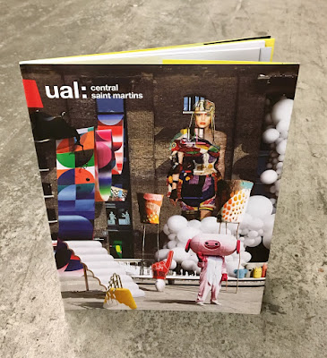
I've written many posts on this blog which includes the phrase "...just the cover makes the difference!" The cover on this prospectus is simply perfect. It is printed on our Astralux, One sided 170gsm, with an amazing image which is a photo composition of 28 works by CSM students,  all laid out with the wonderful King's Cross building as the backdrop.
Click on images to enlarge
The size of the publication is 270x200mm, portrait. The cover has 100mm flaps, which you can see in the birds eye picture below...
The below image shows the opening spread, which shows the 92pp text, which is stepped and printed on a combination of recycled uncoated, gloss art and yellow tinted paper.
Above you can see the way the image wraps around the cover over to the flap - and this is where the real magic happens, because Astralux being a 'Cast Coated' paper it has a high gloss surface one side and is uncoated on the reverse, so you get the juxtaposition of the high gloss coated with the toothy uncoated reverse (printed yellow) as I hope you will be able to see in the image below...
The image below shows the cover in it's entirety, spread out
Click on images to enlarge
The job is PUR bound - a very neat job.
It is a superbly designed piece of literature which has to engage with young creative minds, demonstrate that CSM is a world class arts and design college whilst also satisfying the CSM Alumni! No easy task. Design is by Boyle & Perks.

The excellent print is by Pureprint. It is printed offset Litho throughout in CMYK plus the bright yellow printed as a pantone special.

https://www.arts.ac.uk/colleges/central-saint-martins
http://boyleperks.com/
https://www.pureprint.com/
http://www.favini.co.uk/
Posted by Justin Hobson 15.05.2019

Friday, 10 May 2019

Now Try Something WEIRDER

Yesterday evening I was lucky enough to be invited to the book launch of Michael Johnson's new book: Now Try Something WEIRDER. The launch was at the Johnson Banks studio in Clapham and there were lots of people, drinks and yummy food too.
This is Michael's third book, the others being Problem Solved and Branding in Five and a Half steps, which are both weighty books which have since become required reading amongst design students. Michael spoke about how this book had come about and how this one had been a lot more fun to write!
 ...and there was the opportunity to buy a copy of the book too!
  Thanks to all at JB for a great evening.

...and don't forget to buy the book, which you can do right here:
https://www.laurenceking.com/product/now-try-something-weirder/

http://johnsonbanks.co.uk/
Posted by Justin Hobson 10.05.2019


Wednesday, 8 May 2019

Life - Simon Winnall

Simon Winnall is an advertising photographer, specialising in lifestyle and portraiture work for brands and ad agencies across the world. Here are just some of the names he has worked with: Aquafresh, Bentley, Buckle, BMW, Coca-Cola, DHL, Diageo, Dulux, Ferrari, Folgers Coffee, Halfords, Honda, LG, Lipton, Kopparberg Cider, Microsoft, Nescafé, Nivea, Nokia, Oriflame, Panasonic, Polar, SFR, Sainsbury’s, Sky Sports, Sony, Vodafone, Volvo, Weber Grills, ...and the list goes on!
 
This look-book shows new work and it is a particularly lovely piece of print. The 4pp cover is 325x235mm, portrait and is saddle stitched, however the text pages are a smaller size of 275x210mm, centred inside the cover.
The below image shows the way the text pages sit inside the cover....
It has to be said the size and proportion of the cover and text are just right, the pages just turn and fold well without being dwarfed by the large cover. 
The cover is printed on our Omnia White 280gsm and the 16pp text on 150gsm, the results of which are superb. The look and feel of the whole publication is very uncoated and tactile but there is absolutely no loss of detail in the images as you can see in the detail image below...
Click on images to enlarge
Inside back spread...
A lovely touch is the use of Copper wire for the saddle stitches, which matches the copper foil which is on the front cover...
You are probably assuming that this quality piece of print is printed offset litho, but you would be wrong. This job is printed on a new type of digital printing press, it is a Fujifilm Jet Press 720S. This new B2 size digital press is a commercial inkjet printer, which has been built to produce high-quality short run to medium run digital print. Push Print in London installed the press last year and as you can see from the result on this job, it is producing the high quality print that Push is renowned for.
You can read more about the new Fujifilm Jet Press 720S here or watch their video here...
Photography, design and production is by Simmon Winnall.

http://www.simonwinnall.com/
www.processphotography.com
http://www.push-print.com/
Posted by Justin Hobson 08.05.2019


Friday, 3 May 2019

Canalpath Creative - Cards

Canalpath are a creative agency based in Edinburgh who have recently created their new business cards. The cards are the standard UK business card size of 55x85mm in a landscape format and are produced on our range called Remake.
The cards are simply (but beautifully) printed in one colour and debossed on the face on Remake Sky 380gsm which is duplexed to Remake midnight 380gsm to make a 760gsm, 1mm thick card. The reverse side on the black (midnight) is clear gloss UV varnished.
Click on images to enlarge
Remake is the range produced by Favini and Remake is leather ‘upcycling’ on an industrial scale and represents the latest frontier in upcycling in the paper sector. This unique and innovative paper replaces 25% of wood tree pulp with leather residues. You can read more about Remake here.

Below you can see the duplexed cards.
The below image shows detail of the debossing...
Production of the cards is by Steve Thorburn at Base Print Solutions and they have made an exceptional job of the production.

https://canalpath.com/
http://www.baseprintsolutions.co.uk/
Posted by Justin Hobson 03.05.2019

Wednesday, 1 May 2019

Jobs from the past - Number 115

Regular followers of this blog will know that my first post of every month is a "job from the past" so that I can show some of the really good work from years gone by - this project is from 2013.

McQ AW2013
McQ, is a contemporary brand from Alexander McQueen which takes inspiration from street culture "evoking the varied and ever-evolving style tribes that spring up around Britain’s rich music and art scenes. Drawing on references from uniform and the military, core staples of the British wardrobe are re-imagined each season in new guises. Traditional techniques are used in contemporary ways, creating pieces that are both functional and beautiful"

Creative Director of McQ is Sarah Burton (who next month will be receiving an international award from the CFDA - Council of Fashion Designers of America)

This is the look-book produced for the 2013 collection last year and is simply an exceptional piece of design and print.
The format is A3, portrait. The whole publication is printed on our Astralux [1 sided] 115gsm which is exceptionally high gloss on one side and is uncoated on the reverse. The whole design has played with the opposing coated and uncoated printed and plain areas with dramatic effect.

Opening spread - an uncoated spread

Second spread - high gloss
Click on images to enlarge
It is a 32pp self cover and is unbound, so each of the 4pp section can easily be removed and viewed as an A2 size poster. The monochrome images are reproduced in four colour process (CMYK) printed Offset Litho

Centre spread - high gloss
Uncoated spread - note the right hand page, just printed solid black - gives the project a wonderful sense of space.
The remarkable photography is by Roger Deckker. The superb printing on this paper is by Identity Print. One of the tricky things here is to get the consistency of reproduction between the gloss coated side of the sheet and the uncoated reverse. The result is simply stunning. Gloss sometimes faces gloss, sometimes faces uncoated - it plays with the senses.

Spread below is uncoated on the left page and high gloss on the right..
As I hope the below image shows, it creates great contrast between the dead flat mattness of the uncoated and the high gloss...
Click on images to enlarge
Design and art direction was by Charlie Thomas, in house at Alexander McQueen.

The printing and production is by Identity Print, based in Paddock Wood in Kent and the print quality and repro, in particular is quite simply superb. David Blakeman dealt with the project at Identity and handled the print production.

http://www.alexandermcqueen.com/gb/mcq
http://www.rogerdeckker.com/
www.identityprint.co.uk
www.favini.co.uk
Posted by Justin Hobson 01.05.2019