Tuesday 4 August 2020

Jobs from the past - Number 129

Regular followers of this blog will know that my first post of every month is a "job from the past" so that I can show some of the really good work from years gone by and this publication is from 2016.
 
Money Talks - The Great Swindle by Santiago Montoya

In February 2016, contemporary Colombian artist, Santiago Montoya, presented Money Talks at the Halcyon Gallery, London, which incorporated his mid career museum retrospective The Great Swindle. Montoya reinterprets paper currency as both a canvas as well as a raw material, exploring the added value beyond its very surface. Montoya’s use of money as an artistic medium, also opens a dialogue on the void between state propaganda and reality itself.
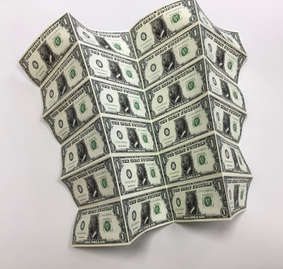
This is the literature which presents the work of Santiago Montoya by the Halcyon Gallery in collaboration with AMA (Art Museum of the Americas) in Washington ...and yes, it looks like a bundle of cash!
This wonderfully deceptive design is actually 48pp folded broadsheet. It is concertina folded vertically and horizontally. The flat size is 398x625mm folding down to 157x65mm and gives the 'wad' of notes a thickness off 4mm. The below image reveals the reverse side.
Click on images to enlarge
In this below image you can see the whole dollar side of the sheet unfolding...
Click on images to enlarge
Above is the dollar side and below is the story about The Great Swindle with a foreword by the Curator José Luis Falconi:
Click on images to enlarge
For would be forgers out there, you will be interested in knowing that this piece of literature is printed on Redeem 100% Recycled 80gsm and is printed offset litho, CMYK on both sides and as you can see from the detail image below the print result is excellent. Redeem is an uncoated paper with a wonderfully neutral tone that somehow gives a lot to the right publication.
The paper band or what is called a "currency strap" in the US, around a 'wad' of notes which is around 4mm thick, finishes the deception perfectly.
Design is by the team at the Halcyon Gallery and the printing and finishing is by Push Print based in London with Anthony Dearlove handling the project.

https://www.halcyongallery.com/
http://www.push-print.com/
Posted by Justin Hobson 04.08.2020

Friday 31 July 2020

INQUE Magazine

INQUE is a large-format annual literary magazine dedicated to commissioning and publishing diverse global writing next to extraordinary art, design and photography, with an editorial remit to be creatively groundbreaking.

Dan Crowe (Editor) and Matt Willey (Art Director) are the duo who love making magazines but hate having to rely on advertising....

"We love giving writers freedom but hate wasting money on distribution. We love working with photographers and illustrators and want to have control over who we commission. We love the smell of paper and seeing it all come together but hate having to publish something when it’s not totally ready. We love the collaboration, the sense of the new, and the unfound, unseen and unpublished. That’s why we’re making INQUE—an exciting new ad-free magazine to be published, one issue per year, from 2021 through to 2030"
Mock-up INQUE cover
They will only manage to achieve their noble aim if YOU support them...

They have launched a Kickstarter campaign and they are 42% of their way to the target figure with 19 days to go. It is achievable but only if you support it and spread the message far and wide...
Mock-up INQUE layout. Photograph by Jack Davison.
Mock-up INQUE layout. Photograph by Christopher Anderson.

You can support the project on Kickstarter... 


Have a look, watch the fab 1 minute video ..and remember to tell all your friends!

You can support the project for any amount but just £45 will get you the first issue with a selection of  incentives, from T shirts to Tote bags and prints etc etc...

Mock-up INQUE layout.

Mock-up INQUE layout. Photograph by Maria Spann.
Mock-up INQUE layout. Photograph by Rich Gilligan.
Mock-up INQUE layout. Photograph by Agnes Lloyd-Platt.
Do something positive and have something to look forward to in 2021!

https://www.kickstarter.com/projects/inque/inque-magazine
https://inquemag.com/
Posted by Justin Hobson 31.07.2020

Wednesday 29 July 2020

Charleston Press No.2

Nestled in the South Downs, Charleston was the country meeting place for the writers, painters and thinkers known as the Bloomsbury group. Now run by the Charleston Trust, the house is an excellent museum and visitor attraction, presented to look as it did when the family lived here in the 1950's. The walled garden was created by the artists Vanessa Bell and Duncan Grant to designs by Roger Fry and features Mediterranean influences with plants chosen for their intense colour and silver foliage. These became the subject of many works over their long residence at Charleston.

Published by the Charleston Trust, the Charleston Press includes includes newly commissioned essays exploring the themes, artists and stories of the exhibitions and programmes at Charleston, as well as articles marking important Bloomsbury anniversaries and events. This is the second issue and I wrote about the first issue here.
Size is 220x170mm, portrait and is perfect bound. The publication has an 8pp 'dustjacket' around the cover as you can see from the birdseye image below...
The below image shows the book (with the Colorset Solar cover) out of the dustjacket (100mm flaps) plus the wrap-around belly-band.
The 4pp cover, which is secreted under the dustjacket, is produced on our Colorset Solar (100% Recycled) 270gsm and is unprinted, being simply, but beautifully, debossed.
The 68pp text is printed on our Omnia 120gsm. The reason that Omnia was chosen is because it would beautifully reproduce the wide variety of different media, the artworks, solid colours and dark photography and most importantly feel special - with the reproduction that you would expect on a silk or gloss but with a natural tactile uncoated feel.
As a journal of essays and images inspired by the Charleston exhibitions titled In Colour, this is a very colourful issue with essays by Dr Darren Clarke, Professor Mary Ann Caws, Anne Starmer, Dr Alexandra Loske and interviews with Cressida Bell and Annie Sloan.
 Quotes on Colour combines images (Green, Blue, Gold and Grey) with quotations from Virginia Woolf's work which makes for a very powerful and engaging article...
The wrap around bellyband (70mm high) which tucks into the book, is printed on our Sixties 60gsm and because of the translucency, the background image shows through beautifully.
...you can see the level of show through in the detail image below.
Below image shows the 6mm spine, the perfect binding. The jacket is printed on Omnia 150gsm.
The reproduction on the Omnia is just something else, the level of detail and reproduction is superb as you can see the image below.
The publication is designed by Playne Design who have studios in London and Hastings. Creative Director is Clare Playne with production is handled by Simon Hack. Print production is by Pureprint. Like the first edition, this is an excellent example of a beautifully designed and well executed piece of print, entirely right for the subject. The publication is available for sale (at a very reasonable £5) HERE

https://www.charleston.org.uk/
http://www.playnedesign.co.uk/
https://www.pureprint.com/ 
Posted by Justin Hobson 29.07.2020

Monday 27 July 2020

The Print Lady says it with flowers...

Ainslie Chivers is the Print Lady. Having been in print for over 25 years, Ainslie now works as an independent print professional managing print jobs for clients, design studios and individuals. She is based in Hampshire and as well as her knowledge of Litho, digital and finishing processes, she also possesses an Adana hand letterpress machine.

...and last week I received in the post a lovely note and examples of our new BOTANICA, Floral seed paper, letterpress printed!
Click on images to enlarge
 Below you can see the details of the petals:
I wrote about this new range, when we launched it on May Day this year HERE. The BOTANICA floral seed paper is handmade for us here in England by Two Rivers Paper, who are based at Pitt Mill in Somerset.

...and here is Ainslie's lovely note:
Because great care has been taken in the hand papermaking process, using 100% cotton, without chemicals and dried naturally (only by air) means that the seeds will germinate and grow. Below, you can see my efforts, grown on wet tissue on our window-sill.
...and my colleague Sarah Glennie has demonstrated her horticultural skills using compost in the image below - 4 weeks after planting:
My thanks to Ainslie for taking the time to send me examples and for spreading the good news of this new range to her clients.

https://www.printlady.co.uk/
Posted by Justin Hobson 27.07.2020

Friday 24 July 2020

The Medium's Medium

The Gallery of Everything is London's first and only commercial space dedicated to non-academic and private art-making. The gallery's roster includes major historical master artists and newly discovered authors and creators. A British non-profit organisation, committed to the advancement, integration and celebration of artists and makers beyond the cultural mainstream.
Last year they presented an exhibition titled 'The Medium's Medium' a two part exploration into spiritualist and mediumistic art practices from the 19th century to the present day.

This is the catalogue which accompanied the exhibition and features drawings and paintings by a diverse range of authors, from established names to newer (re)discoveries. The catalogue is produced in the style of a 19th century pamphlet or chapbook as they are sometimes called.
Size is 210x165mm, portrait and is a 60pp 'self cover' which is saddle stitched. It is printed on our Redeem 100% Recycled 60gsm, which is a neutral white shade, which has the perfect tone for a 19th century publication and the 60gsm weight means it flows and flops perfectly...
It is printed offset litho throughout and the majority of pages are just printed in black only.
However, towards the middle of the publication, the drawings and paintings are reproduced with amazing clarity...
Click on images to enlarge
Centre spread, below
A lovely feature is the use of copper wire for the saddle stitches:
The 60gsm weight is just perfect for the publication.
...and even though this is a 60pp, the thickness is only 2mm! and it doesn't 'gape' in the spine as a heavier paper would, as you can see in the below image.
Print is by Identity Print, based in Paddock Wood with Paul Martin handling the project. You can read more about the exhibition here.

https://www.gallevery.com/
http://www.identityprint.co.uk
Posted by Justin Hobson 24.07.2020