Thursday, 24 December 2020

When does a rainbow become an Amazebow?

Earlier in the year Superunion designers from around the world came together to create a colouring book for girls from disadvantaged backgrounds.
During the dark days of the first lockdown we were asked by Superunion to collaborate on a colouring book project  Superunion had partnered with I Can Be, a children's charity that breaks down barriers to future opportunities for disadvantaged girls, to create Amazebows, a colouring book designed to remind young girls of their potential and to help them realise the power of their imagination. With 24 unique illustrations created by Superunion creatives from around the world, from Brazil to Singapore, Amazebows shows the girls that something even as predefined as a rainbow can be reimagined.
Initially the project was the idea of  Leanne Kitchen, Stuart Radford, Scott Lambert, Louise Hunter and Inga Howell, the key to the idea was the collaboration with the global network of Superunion creatives. The brief to each creative was left entirely open, to reimagine the rainbow, asking only to include the seven familiar coloured stripes of the rainbow, which start and finish on two sides of the page.
Amazebows was produced pro-bono, sponsored and printed by Identity Print and Fenner Paper, to help girls with no access to online schooling or tools during lockdown. The 200 colouring books were singer sewn with thread to match one of the seven colours of the rainbow as you can see in the below image...
The superb singer sewing was produced by Wayte Fine Binding, who are Identity's own bindery.

Along with each book, the Superunion team gave every girl, rainbow coloured pencils in an origami paper sleeve...
Leanne Kitchen said: "Working with I Can Be during lockdown was really important to us, helping them to reach out to the girls they work with and spread their message to children in those really difficult times. With this in mind, we wanted to build on the familiar symbol of hope, simply allowing their imaginations to explore the idea that if a rainbow can be anything, so can they. We'd created such an open brief, with only a couple of compositional guidelines, so that creatives across our network could really inspire the girls to continue to imagine their own possibilities. This charming objective led to some beautifully unexpected illustrations for the colouring book and brought many of our creatives together at a time of isolation. We're also very grateful to have partnered with Identity Print and Fenner Paper to produce Amazebows, who have been integral in enabling the team to gift a physical colouring book to each of the girls."
It was a superb project to be involved with and is the result of amazing collaboration.

Monday, 21 December 2020

Pergraphica Calendar for 2021

We have a new 2021 'tent' calendar produced for the PERGRAPHICA® range of design papers. Pergaphica is a range of premium design produced in Austria by Mondi and features smooth and rough finishes in High White, Classic and Natural shades.
The size of the calendar is 310x150mm (flat size) and folds into a tent 112x150mm, held in place with a locking tab. 
Click on images to enlarge
The calendar is printed offset litho on Pergraphica, Natural Rough 240gsm. The below image shows the locking tab...
Fenner paper is pleased to be the UK stockist for Pergraphica. One fact that might be of interest is that we keep 120-300gsm in Short Grain B1 sheets - which can be very useful if you are looking for a specific grain direction.

If you would like one of these calendars to adorn your studio desk or more likely your home office! drop me an email and I'll pop one in the post: justin@fennerpaper.co.uk

Posted by Justin Hobson  21.12.2020

Tuesday, 15 December 2020

Community Clothing 04

Founded by British Fashion Designer Patrick Grant, Community Clothing is a social enterprise with a simple mission - to make excellent quality affordable clothes for men and women, to create great jobs for skilled workers and by doing this help to restore real pride in Britain’s textile communities. They do this by working with under utilised UK factories during their quiet periods, which is a great concept.

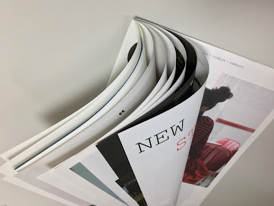
This is Community Clothing's look-book and catalogue CC4 and it is an absolutely superb publication, wonderful art direction, photography and printing. I wrote about the previous publication CC3, last year.
The size is 315x210mm, portrait and is a 32pp self cover which flops and rolls really nicely in the hand....
Click on images to enlarge
The publication is printed on our Shiro Echo, White 80gsm which is 100% Recycled and also carries the FSC Recycled classification. 

Shiro Echo is available in two shades; there is a white shade (which is a natural/off white) which is a bit like a newsprint/newspaper shade and a Bright White shade.
The publication is printed offset litho in CMYK throughout. The colour is bright and vibrant and the image reproduction is excellent as I hope you can see - bear in mind it's printed on an 80gsm 100% Recycled!
Below is a detail image which shows the excellent image quality - note the excellent fleshtone reproduction.
Click on images to enlarge
The below spread explains the mission and the locations in the UK where the 28 factories are located.
Design is by Moving Brands. Printing is by Principal Colour. A really superb piece of design and print.

Posted by Justin Hobson 15.12.2020

Friday, 11 December 2020

Cards - Made by Shannon

One of the great pleasures I have doing this job is receiving lovely things in the post and last week, I received a lovely selection of cards from Made by Shannon...

This greeting card publishers is run by a lovely lady called Shannon and they are based in Surrey. The below card is printed on our CRUSH Grape 250gsm
Click on images to enlarge
Above is a more detailed image and hopefully you can see the small specs and inclusions in the paper. Crush is made partly using the residue from the industrial processing of agro-industrial "end of life" products replacing up to 15% of conventional tree pulp. The 15% process residues are combined with 40% recycled fibres (post consumer waste) and the remainder is FSC virgin pulp and the product is FSC certified. The range is produced using green energy and is carbon balanced at the mill gate (we can also supply the paper in the UK, certified as carbon balanced)
The A6 cards are printed and hot foil blocked in-house, where they have letterpress and a 1980's hot foil blocker which is used on cards and envelopes. However, they also sometimes just hand apply gold leaf as you can in the small embellishment below.
The above SIXTEEN TODAY card is printed on our Colorset Storm 270gsm. The beautifully hot foiled envelopes are made using Colorset Storm 120gsm.
...which also have a superb embossing on the flap:
At this time of year, personalised Christmas cards are in great demand and below is an example printed on our CRUSH Kiwi 250gsm.
Click on images to enlarge
Thank you to Shannon for sending me this selection and if you would like to see her range of cards and gifts, you can see them HERE.

Tuesday, 8 December 2020

Fenner Paper 2021 Diary

I am pleased to reveal the Fenner Paper 2021 Diary...
As in previous years, the diary is 230x162mm, portrait and retains the popular 'month to view' format. The cover board is printed offset litho in just one colour - silver pantone colour 877 on both Colorset Charcoal and Colorset Deep Blue 270gsm.
This year the diary has been designed by David Coates, independent designer and board director of ISTD.
The 40pp text is typeset in Foundry Tiento and Foundry Unie from The Foundry Types and is simply printed in one colour, offset litho, on our lovely Offenbach Bible 60gsm, which has a superb opacity and a good writing surface making this an ideal paper for a diary or notebook.

If you are one of our worthy clients (!), you should be receiving one of our diaries in the post but if you would rather have it sent to your home than the office or if you want to make sure you are in our address book, drop me an email: justin@fennerpaper.co.uk
Posted by Justin Hobson 08.12.2020

Friday, 4 December 2020

Christmas Crackers using Crush Corn

Luisa Vicinanza-Bedi only started learning how to make bean to bar chocolate in 2017. Since then she has established her own shop Luisa's Vegan Chocolates based in Sneinton Market, Nottingham and has a strong online presence. Luisa has also picked up a handful of awards at the Academy of Chocolate including  ‘UK Rising Star’ in 2019.
Photographs courtesy of Luisa's Vegan Chocolates
As part of Luisa's special Christmas offerings, there are these yummy Christmas Crackers - packed full of goodies and all products happen to be vegan too!
Photographs courtesy of Luisa's Vegan Chocolates
These beautiful crackers are printed on our CRUSH range of papers, made using 15% agro-industrial residues combined with post consumer waste and virgin fibre (all FSC accredited). The cracker body is using Crush Corn 200gsm and the chocolate box wraps are 120gsm. They are superbly digitally printed and foiled by Rose Press in Nottingham, who usually specialise in Wedding stationery.
Photographs courtesy of Luisa's Vegan Chocolates
Luisa's Vegan Chocolates is the first and only Bean-To-Bar chocolate maker in Nottingham, taking her chocolate through the delicate artisan process by hand. Luisa directly sources her beans to pay her farmers a better than FairTrade price for their crop, at least double the standard market rate which is wonderful.

So in this year of the online Christmas Shopping, how about supporting an ethical small enterprise?... and what better present to get your Mum, Dad, Aunt, Uncle, Grandma, Children etc etc - You can buy online HERE.

Posted by Justin Hobson 04.12.2020

Wednesday, 2 December 2020

Jobs from the past - Number 133

Regular followers of this blog will know that my first post of every month is a "job from the past" so that I can show some of the really good work from years gone by. Given the sad news this week that the Arcadia group has gone into administration, I thought I'd show you this superb project for Topman which is part of Arcadia.

Topman - Spring/Summer 2011

Topman is the Arcadia group's fashion conscious male brand and this piece of literature is produced to the very highest standard with superb art direction, photography and print reproduction - and a few little tricksy surprises lurk within as well!
This lookbook is 350x280mm, portrait format which is just a lovely size - different (not uneconomical either) but just feels right for it's sub A3 and slightly squarer format.
The piece has a 4pp cover and a 68pp text and is perfect bound.
It is printed offset litho in CMYK throughout - colour reproduction is fantastic - solid flat areas of colour work amazingly well as do the mono images. The sense of space in the job is fantastic - the spread below has a completely blank page - an excellent unhurried piece of design for print. 
...and here's for the surprise (well three of them actually). There are three smaller (310x230mm) right hand page "throw outs" with closer up detail shots. These are printed on our high gloss, one sided cast coated paper Astralux 115gsm. The images are printed on the gloss side (see below) and the uncoated reverse (see above pic) is printed in a flat solid cool grey.
The below image shows the flat uncoated reverse side of the Astralux, printed grey over the high gloss face side with the CMYK images...
The 68pp text is printed on our Omnia 120gsm which gives it that dead matt, tactile feel but with great reproduction - let the pictures do the talking...
Below is the detail image showing the fantastic reproduction on the Omnia:
For me, one of the joys of this piece of literature is the way it easily flows in the hand. Many designers will use a really heavy cover when producing a document with a substantial number of pages and this can cause disruption with the way the cover interacts with the text - it can be way too flicky! The cover of this job is 200gsm - it is on Omnia, which is a bulky material, but it is the perfect weight.
The cover is beautifully hot foiled blocked in gloss white foil.
...and if that wasn't enough the whole book is inserted into a custom made capacity envelope, also made out of Omnia 200gsm.
Art Direction and design was by Gill Patchett who worked in-house at Arcadia. Production was by Stephanie Johnson. Photographer is Boo George  with production at Streeters. Printing was by Ortek printers in Walsall. Gill very kindly sent me some file copies:
So what are people doing now? Arcadia has gone bust this week. Sadly Ortek Printers went bust back in 2017. Gill Patchett is now a freelance Art director and Designer ...and Fenner Paper? yep, we're still here doing good stuff!


...and if you'd like to read my original post about this job from 2011 and see how my powers of description and prose have improved, you can read it HERE.
Posted by Justin Hobson 02.12.2020