Thursday, 1 April 2021

New A4 sample service launches today!

Very exciting news today!

Some readers of this blog may not even remember the humble Fax machine, but for many years they sat in the corner of the offices and studios of the land, humming away and allowing us to receive communications across the miles, before the internet...
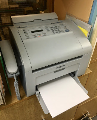
So why am I telling you about these outdated office machines? Well, with the recent updating of the  UK broadband network, increased bandwidth and faster speeds, technology company Looflir PA has developed a program which enables paper samples to be delivered directly via the fax machine to your studio. Not only does this mean you can get your samples straight away, it also saves the environment as we will no longer have to send A4 samples by post or courier...
So now is the time to look out for those old fax machines in store cupboards and under desks and get them plugged in! And the good news is that even though Fenner Paper is the one that partnered with Looflir PA to pioneer this new concept, the new technology will be rolled out to the rest of the industry including other paper merchants and paper mills, which will make receiving samples from other parts of the world much easier.
Above is a sheet of our Colorset 100% Recycled, Bright Red 270gsm arriving on a Samsung machine during testing. Please note that there is a limit to the weights that can be sent and currently we are unable to send anything 1mm or over, so sadly we cannot send our SUMO range.

To sign up for the new service, please email samples@fennerpaper.co.uk and we will send you the relevant information and the download procedure. 

https/looflir.pa
Posted by Justin Hobson 01.04.2021
12.00 - time to reveal that this post is in fact an April Fools joke! hope you enjoyed it
Cheers
Justin

Tuesday, 30 March 2021

Vive Le Vodka Martini!

To create GREY GOOSE vodka, François Thibault maintains an unrivalled level of craftsmanship, using only the very finest ingredients. Its signature smoothness and distinct character are the result of an extraordinary passion for spirit making and an unparalleled commitment to the highest possible quality. 

Grey Goose have produced this little booklet of Vodka Martini cocktails that can be made using their Vodka including a look at the history of the Martini and contemporary reinventions.

Size of the booklet is A6 (148x105mm) portrait and has a 4pp cover on Omnia 200gsm and 12pp text on 150gsm.

Click on images to enlarge
Omnia was chosen because it would work with the rich detail that is present on the cover image but that would still give a natural look and tactile feel to work with the beautiful illustrations used to accompany the recipes. Printed offset litho throughout.
As you can see from the image below, it sits open on it's own, so if being used in a bar, it will stand up perfectly.
...and as you will also be able to tell, it has been properly matrix creased and the saddle stitches are perfectly central. It's details like this that get noticed on smaller printed pieces like this.
Creative direction and design is by London based branding agency Ragged Edge and litho printing is by Identity, based in Paddock Wood, Kent.

Posted by Justin Hobson 30.03.2021

Friday, 26 March 2021

Dark Objects

This is the private view invitation produced for the Huxley-Parlour Gallery. The occasion is the opening of a retrospective exhibition of works by acclaimed American painter Donald Sultan. Spread over two floors of the London gallery, the exhibition includes 17 works produced from 1977 through to 2019. His series ‘Black Lemons’ was exhibited at the Museum of Modern Art, New York in 1988, and preceded an in-depth investigation into the reduction of form. 

Size of the invitation is A5 (210x148mm) portrait and is itself an example of reduction of form, being very simply, but beautifully, hot foil blocked on both sides with gloss black foil using our Sumo, Black 1.5mm board.
The below image should give you some idea as to the 'heft' of the board!
Design is by Dan Cottrell Studio based in London and Amsterdam. Superb hot-foil blocking is by the Geoff Neal Group based in Feltham.

https://huxleyparlour.com/

Posted by Justin Hobson 26.03.2021

Tuesday, 23 March 2021

A Life Less Ordinary

Mulberry Mongoose is a jewellery workshop, located on a well-trodden elephant path in the remote Zambian bush. Local craftswomen make all the jewellery by hand using natural materials from the South Luangwa valley and this is their story...
This lovely little book, tells the story of how the enterprise began, the jewellery, the characters and the materials used to make the pieces. 
Click on images to enlarge
The size of the book is a cute 130x95mm, portrait. The 40pp text is printed on Flora Anice, which as you can see from the image below has visible flecks of natural wood shives which gives the paper a visible, natural look.
The chapter divider spreads are printed using a gorgeous solid magenta...
Flora is produced with 30% post consumer de-inked waste, together with 60% of virgin FSC pulp 10% cotton fibres, which gives the paper a wonderful tactile feel. 
There are these superb illustrations used to illustrate the stories, absolutely gorgeous!
Click on images to enlarge
...and similarly, the beautifully illustrated map:
The book is perfect bound, which as you can see from the image below is nice and neat with a 5mm spine. The excellent print and finishing is by Identity Print, printed offset litho throughout.
The Mulberry Mongoose brand identity and design is by Matt Morgan.

Posted by Justin Hobson 23.03.2021

Monday, 22 March 2021

Are movie posters artwork?

On 14th April you can join art director and movie poster designer, Art Sims for an exciting Zoom lecture. Discover how he captures the essence of a 90 minute feature film in one frame image to get a person excited to see it in the 10 second window that they are likely to see the printed image. This is a fantastic opportunity to hear insights and the process behind the designs from the man responsible for creating iconic posters for The Black Panther, Tarzan, Do the Right Thing, Malcom X, Clockers, Dream Girls and more.
Art Sims is the founder and CEO of 11:24 Design Advertising who “tell stories that spark consumer movement” and are based in Los Angeles. Sims is dedicated to promoting African-American art and culture as part of a larger mandate he dubs “urbanization,” which refers to the recognition and melding of disparate cultural and creative histories. “I love doing work for and about African Americans. I feel I am reshaping history to show our beauty.”
Sims attended Cass Technical High School in Detroit before earning a scholarship to Michigan State University. Once graduated, he landed his first job in New York before heading to LA where he set up his own company gaining attention from directors including Spike Lee and Steven Spielberg.
Sims also teaches graphic design at Otis School of Design, and launched a project called the Artists in Residence Foundation, designed to unite artists with students who don't have art classes at their schools. Book Online HERE  for an incredibly reasonable £5!

(Biography taken from an Aiga interview in 2008 written by Holly Willis – to read more, please visit https://www.aiga.org/design-journeys-art-sims). 

This talk is part of the ‘Celebrating 125 Years of St Bride Library’ lecture series and has kindly been sponsored by: Adobe Commercial Type,  Eye Magazine, Eric de Bellaigue, Google, Jerry Wright, Just Another Foundry, Klim Type Foundry, Lexon GB, Creative & Innovative Print,  Mayor of London,  Medioto - Graphics & Animation,  Peter Longland, R-Typography, Type By, Usborne Publishing and The Wynkyn de Worde Charitable Trust who have sponsored students and recent graduates across the UK to attend this lecture.
Posted by Justin Hobson 22.03.2021

Friday, 19 March 2021

Cradle to Cradle award for Lessebo

Cradle to Cradle is an approach for a continuous and consistent circular economy. You could also say that it is a vision with the goal of reducing the impact on nature, both with raw materials but also in terms of water stewardship and social responsibility.
The Cradle to Cradle should make a radical way of thinking in cycles starting with product design, manufacture, and use. The principle, which can also be perceived as a philosophy, was designed in the late 1990’s by the German chemist Michael Braungart and the American architect William McDonough. Cradle to Cradle products are therefore those that can either be returned to biological cycles as biological nutrients or that can be kept continuously in technical cycles as technical nutrients.
The Lessebo Mill is the only paper producer to be awarded GOLD certification, which was awarded this month.  Lessebo is a town in a remote area of southern Sweden called Småland. and is surrounded by a rugged terrain full of boulders and dense forests between large shallow lakes. Bruk is the Swedish word for mill, hence the name of the mill, Lessebo Bruk.
Founded in the middle of the 17th century as an iron mill, it was granted permission by the local government to produce paper in 1693. It should go without saying that all paper was made by hand at this point in time and it wasn't until the 19th century that paper machines were invented. It is also worth noting that the mill still Handmade Paper studio ...where I have actually made paper!

Lessebo Bruk is a mill with complete focus on forest based products with a modern product mix of graphical papers, dissolving cellulose and energy - in fact their power plant heats the town swimming pool as well as a great many of the houses in the town!
We have been working with Lessebo for nearly thirty years and I have written about their paper on this blog before. So it certainly wasn't a surprise to me that this Swedish mill should be awarded Gold certification and the fact that their close competitor, Arctic Paper has only achieved Bronze certification for their Munken papers has probably raised a wry smile at the mill!

If you would like a swatch of the Lessebo Design range, just drop me an email: justin@fennerpaper.co.uk

Posted by Justin Hobson 19.03.2021

Wednesday, 17 March 2021

The Old Sorting House

The origins of the Old Sorting House in Islington, London, are both rich and varied. An intriguing mix of businesses have graced this imposing building, but it is the original use as the Northern District Post Office, opened in 1858 which fires the imagination. The building was recently put up for sale and this is the excellent sales literature which was created by Everything In Between.

Click on images to enlarge
The size of the brochure is 250x190mm, portrait and as you can see from the above image, there is a superb blind embossing on the front cover
This is a relatively unusual design, which works superbly. As you will notice in the above image, it has a square spine, which houses a saddle stitched text, however there is also another text section housed in the inside front cover. The cover is a 6pp and this text is under the flap that forms the 6pp, so in the image below, showing the open brochure, you are faced with two separate contents, one on left and right. 
The image below, has the cover of the left hand content open...
Click on images to enlarge
The left hand book, which explains and shows the history of the building is a 12pp text and the main book on the right hand side is a 48pp. It is printed on our Redeem 100% Recycled 315gsm cover and the text is all printed on a 130gsm.
Redeem 100% Recycled is a very neutral white shade and has an 'aged' look and feel to it, which is one of the reasons that it was chosen for this publication and it really works, but not only with the historical images (above) but it works just as well with the CGI's (below)
In the centre of the main brochure is a double gatefold allowing for a superb, wide image.
Click on images to enlarge
It might surprise you to know that this project is digitally printed, however as you may have noticed, the centre throw-out measures 760mm wide, so, the only way to produce this is on the HP Indigo 10000 presses, which prints a B2 sheet. Although Redeem is not a 'digital' paper, it has been Sapphire Treated to make it compatible with HP Indigo printing. 

Below shows the superb square spine, where you can just about see the saddle stitching, which is perfectly situated on the crease at the back of the spine.
Brochure and website design is by London consultancy, Everything in  Between. Arran Scott-Lidgett is creative director and the designer on the project was Katie Alger.

Print production is by Pureprint and there's no question that this job is superb. Beautifully printed and bound, productions like this make the case for clients using print. All the information in the publication could (and is) supplied digitally, but this piece of literature is and will be a piece of history.

Posted by Justin Hobson 17.03.2021