Friday 16 September 2016

Grunts & Grapples!

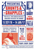
Yesterday evening, I was invited to the opening of a new exhibition at the Tunbridge Wells Museum. Grunts and Grapples is an exhibition which celebrates the popularity of live and televised wrestling from the 1950's up until the 1990's.

"Greetings Grapple Fans" was the opening line by Kent Walton, the wrestling commentator on ITV's World of Sport, first broadcast on the new ITV in 1955 up to 1989 with audiences peaking at twelve million!

Wrestling was a central part of British national life in this period with iconic figures such as Giant Haystacks and Big Daddy appearing in hundreds of UK town halls and theatres night after night as well as featuring on TV. Through posters, photographs, souvenirs and costumes, the exhibition reveals the origins of wrestling’s interplay of sport and spectacle and the development of personas.
The exhibition features the original costumes of the legendary wrestlers Big Daddy and Adrian Street together with a mask from the mysterious Kendo Nagasaki. A Pathé film from 1964 showing women’s wrestling at the Victoria Hall, Hawkhurst is shown, alongside posters and programmes.
Also featuring in the exhibition is So Many Ways To Hurt You, The Life and Times of Adrian Street, 2010; a film by Turner prize-winning artist Jeremy Deller.
The show is curated by Kerry William Purcell, writer, theorist and historian. He has written and published books on art director and designer Alexey Brodovitch, photographer Weegee, and Josef Muller-Brockmann, all published by Phaidon. He is a Senior Lecturer in Design History at the University of Hertfordshire.

Exhibition design and graphics is by Jess Harris.
The exhibition runs until January and entry is free.

http://www.tunbridgewellsmuseum.org/
http://www.gruntsandgrapples.com/
Posted by Justin Hobson 16.09.2016

Monday 12 September 2016

Yorkshire House

Yorkshire House is a landmark 1960's building in Greek Street, central Leeds. Having undergone a major refurbishment, it now provides 83,000 square feet of prime office space. The refurbishment has been done in such a way that this is now a low carbon office environment. The scheme incorporates 'the Yorkshire Hub' which is a range of flexible office spaces specifically aimed at the creative and media industries.
 
This is the sales brochure for the new complex, which is designed to appeal to the design savvy clients that are the target audience.
The size is 297x240mm and the cover, or covers are silkscreen printed on 2000micron Greyboard, which has been mounted on the actual cover to make a nice chunky cover.
Click on image to enlarge
The book has two front covers, a format I have described before as a 'double-ender'. The white cover is the "Introduction to Straight Thinking" and the Red cover introduces the fact that this is a buzzing creative environment with a distinctive Yorkshire touch....
You can see below with the cover spread out...
The actual 4pp cover is printed on our Colorset Bright Red 350gsm (which then has the Greyboard mounted on the outside. The below spread shows the inside front cover, with the Colorset on the left, which has been silkscreen printed in one colour (white).
A striking feature is the 'three hole sewing' used for the binding (see below image). There are two 'banks' of three hole sewing - making six holes in all, using white thread.
Click on images to enlarge
The 32pp text is printed on our Omnia 150gsm. This choice of materials works with the design superbly. Lots of white space, with the paper feeling tactile and the predominant red and blacks looking really punchy and the four colour images looking fabulously detailed and crisp, in a way that they just wouldn't on a traditional uncoated paper.
Omnia has an uncoated look and feel but it has a surface treatment which means the printed result is similar to that of a coated paper - bright, vivid and punchy. The text throughout is printed offset litho.

The centre spread (below) with the two banks of three hole sewing in the spine.
Below image shows the top and foredge of the book and the way that the Greyboard is mounted on the cover. The total thickness is 9mm.
To go with the brochure, custom envelopes (324x265mm) were manufactured using Colorset Bright Red 120gsm and also silkscreen printed in white.

Detail of silkscreen on envelope
Art direction and design is by creative consultants Heavenly. Creative director on the project is Tony de.Ste.Croix.

Printing, including production of the silkscreen cover and the superb finishing and three hole sewing, is by Gavin Martin Colournet.

http://yhleeds.com/
http://heavenly.co.uk/
http://www.gavinmartincolournet.co.uk/
Posted by Justin Hobson 12.09.2016

Thursday 8 September 2016

FLUX

FLUX is a new magazine for lawyers which is published as a collaborative project between LexisNexis and the Cambridge Judge Business School. The publication celebrates diversity and women in law, and focuses on outstanding contributions to the legal industry within in-house and top law firms, on both a national and international level
Cover illustration by Jason Ford
Size of the magazine is 280x210mm and is printed on our StarFine White, with a 4pp cover on 240gsm and 48pp text on 130gsm giving the publication a 5mm spine. StarFine is a quality, uncoated paper and as the images show, image reproduction is excellent. The solids, photographic images and the illustrations look stunning - a great amount of detail for an uncoated paper, colours are bright and vivid.
The magazine is produced by YBM who are specialists in magazine publishing and content. The editor is Mira Katbamna. It is printed offset litho in CMYK throughout by London based Park Communications.
The superb art direction is by Zoë Bather. The design reflects the accessible tone of the title’s features and interviews. The use of illustration throughout the publication, probably more than images, create a gentle pace but the title pages use an energetic mix of solid colours and typography. I noted all the illustrators, who are: Ben Kirchner, Holly Wales, Olivier  Kugler, Allan Sanders, Hanna Melin, Jason Ford
Another interesting feature is the use of Gloss UV varnish on the title header and illustration (by Jason Ford) on the front cover (pictured below). A single hit of gloss UV varnish has worked really well and just gives the cover a point of difference,
The magazine is produced by YBM. Editor is Mira Katbamna. Art direction by Zoë Bather. The excellent print is by Park Communications, who are based in East London.

https://www.jbs.cam.ac.uk/home/
http://www.lexisnexis.co.uk/
https://ybm.co.uk/
http://zoebather.co.uk/
http://www.parkcom.co.uk/
Posted by Justin Hobson 08.09.2016

Tuesday 6 September 2016

An Evening With Vint Cerf

Yesterday evening I had the pleasure of attending a talk in London by Dr Vinton Cerf. Widely known as one of the "Fathers of the Internet".  Cerf is the co-designer of the TCP/IP protocols and the architecture of the Internet along with his colleague, Robert E. Kahn. As a Vice President of Google, he contributes to global policy development and the continued spread of the internet. The lecture was at Stationers' Hall in London and hosted by three city of London Livery companies including the Stationer's Company.
The hall was packed to capacity. Vint Cerf is an excellent speaker, injecting his talk with personal anecdotes and humour. He fears that future generations will have little or no record of the 21st Century as we enter what he describes as a digital Dark Age. "Even if we accumulate vast archives of digital content, we may not actually know what it is” His concerns about archiving our digital age are many and he is spending much time looking into the problem and the possible solutions. He outlined many of the issues whilst introducing those people and institutions who are also trying to address the problem of archiving the internet.

When pontificating about the current best way to preserve information for the future, he said "best to print it on some good quality paper and store it in good conditions" (I've paraphrased the remark) - an interesting comment in this day and age.

The lecture was excellent and left the audience all wondering for the future....
https://stationers.org/

Readers may also be interested to read the article I wrote previously about a paper mill in Finland that has been converted to a data farm by Google!
Posted by Justin Hobson 06.09.2016

Saturday 3 September 2016

Peace Signs

In May, I wrote about the opening of an exhibition at the Imperial War Museum called Peace Signs , by the photographer Edward Barber and I was pleased to have been invited to the opening. http://justinsamazingworldatfennerpaper.blogspot.co.uk/2016/05/peace-signs-by-edward-barber.html

This is the simple piece of literature which accompanies the exhibition.  It's a well designed, beautifully produced piece of print with high impact. The finished size is 152x108mm folding out to a flat size of 304x434mm.

The mono image is printed with a border of  'nuclear' yellow which reflects the colour used on the walls in the exhibition. There is one image on the front...
...on the reverse is an image of the graphic installation entitled the Mind Map of Anti-Nuclear Protest, created by Danielle Inga and Edward Barber specifically for this exhibition. It's folded as a map fold - concertina and then folded over.
Click on Images to enlarge
One thing which is almost impossible to convey is that it's been printed on our Offenbach Bible 60gsm. It is superbly light and has a great "rattle" which it's just not possible to convey in pictures. It folds and handles beautifully.
You probably won't be able to guess, or even believe, is that it's digitally printed! The job was printed and finished by a digital print company called Typecast Colour, based in Paddock Wood, Kent. It was printed on their Xerox digital press and the result is superb. Printing digitally printing the limited run viable - even on a material such as this, which many litho printers are scared of!...just look at the print result.

...and there is an interesting story as well. Fran De'Ath is the lady in the main photograph and she was interviewed for The Guardian last month for their series called "That's me in the picture"
https://www.theguardian.com/artanddesign/2016/aug/12/one-person-picket-fran-death-protests-greenham-common

If you want to see the exhibition, you'll have to hurry as it finishes tomorrow (4th September)

http://www.iwm.org.uk/exhibitions/iwm-london/iwm-contemporary-edward-barber
http://edwardbarber.net/
http://concreteed.blogspot.co.uk/
http://www.typecast.co.uk/
Posted by Justin Hobson 03.09..2016

Thursday 1 September 2016

Jobs from the past - Number 83

Regular followers of this blog will know that my first post of every month is a "job from the past" so that I can show some of the really good work from years gone by and here's one from 2012. 

Alexander Brodsky Catalogue
Oct/Nov 2012

Founded by Nonna Materkova in 2009, Calvert 22 is focused on supporting and sharing the contemporary culture and creativity of the new east – eastern Europe, the Balkans, Russia and Central Asia – enriching perceptions of the region and furthering international understanding. Through a regular programme of exhibitions, publications and debates Calvert 22 has established itself as a significant presence in the international contemporary art scene as it continues to support both established and emerging artists.
Photo courtesy of Russell Warren Fisher
This is the catalogue produced for the first UK showing of Russia’s leading avant-garde architect, Alexander Brodsky. White Room / Black Room saw Brodsky transform an entire floor of the gallery into two rooms filled with light and darkness, making for a fully immersive experience. Viewers entered through a small door and the space was divided into two contrasting rooms first encountering a seemingly endless corridor of white light and then a more confined darker chamber, hidden from view and filled with blackness.
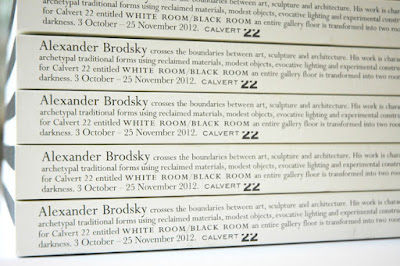
The exhibition catalogue was designed to reflect this Black Room and White Room with a book divided in two halves, half with the text in white and half with the text in black. The publication is what I would describe as a 'double-ender' - the cover and text read one way and then you turn it over and it reads the other way. The image below, shows the way the cover works:
Click on images to enlarge
To further reflect the black and white theme, the pages of the catalogue at either end are unprinted pages which are 'Ram Punched' with a shape to represent the seemingly endless corridor of white light.
...and then a shape to represent the darker chamber:
The size of the book is 243x168mm, portrait and contains a total of 322 pages, which gives the book a chunky 21mm spine. The 322 page pagination includes equal thicknesses of black and white text paper and a 32pp centre section, without ram punching, on which the story about the exhibition is told.
Click on images to enlarge
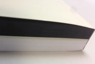
The cover and middle section of text is printed on our Redeem 100% Recycled (315gsm and 100gsm). It is printed offset litho in just one colour. The 130pp of black, uses our Colorset Nero 120gsm and the below image shows how the black/white divide works
Click on images to enlarge
Catalogue design is by Russell Warren-Fisher, who runs his studio in Corsham just outside Bath. You can see other exhibition catalogues he has created here. Russell also created the brand identity and logotype for Calvert 22.

Print is by Emtone in Bath and as you can see, it was a seriously tricksy bit of finishing with a perfect 10mm thick cut
You can read more about the exhibition here:
http://calvert22.org/exhibitions/white-room-black-room-alexander-brodsky

http://calvert22.org/
http://www.rwfhq.com/
http://www.emtone.co.uk/
Posted by Justin Hobson 01.09.2016

Tuesday 30 August 2016

SWD - Information Design

SWD is a graphic design company based in Holborn London. They have a wide and varied client base and their work covers an extensive range of disciplines. This piece of literature is one of a series of promotional pieces - and this one demonstrates their work in information design. 
Printed offset Litho in CMYK plus a special pale green. It's printed on Omnia 120gsm, which gives it a lovely tactile feel but the images have reproduced superbly. Finished size of the piece is 140mm square, which if used as a mailer, can be mailed out economically in a 155mm square envelope.
Folding out to 420mm...
and out again...
...to reveal the centre spread
Below image shows the reverse of the mailer.
Design is of course by SWD, Creative Director is Shaun Webb. Printing is by Chadbon Printing based in London.

http://www.swd.uk.com/
chris.chadbon@btinternet.com
Posted by Justin Hobson 30.08.2016