Monday 24 August 2020

New SUMO swatch

SUMO is our a heavyweight, thick board manufactured by FAVINI in Italy. It is available in black and white and the consists of 1mm, 1.5mm, 2mm up to a whopping 3mm thick  ...seriously chunky! Last year, the range was extended to include a small range of colours - five new shades all available in 1mm thick and below is the new lighter weight swatch...
 Size of the swatch is 240x152mm with 10mm spine
Thanks to the dyeing process, the colour distribution is consistent throughout to give excellent results especially when the edge is visible. The finest quality makes Sumo perform excellently for invitations, tags, covers, business cards, luxury POS material and high-end packaging.
The SUMO range is FSC certified. Below shows the five new shades, all available in 1mm thick.
If you would like samples, please drop me an email: justin@fennerpaper.co.uk

http://www.favini.com/gs/en/fine-papers/sumo/features-applications/
Posted by Justin Hobson 24.08.2020

Thursday 20 August 2020

XX: A Novel, Graphic

This is the title of a forthcoming book by Rian Hughes and also a talk (via Zoom) which is being hosted by the St Bride Foundation on September 2nd.
‘Brilliant, exciting, absorbing and mind-blowing... a perfect work of art about what it means to be human in a world of gigantic ideas’ Grant Morrison
Rian Hughes is a graphic designer, illustrator, comic artist, writer and typographer who has worked extensively for the British and American advertising, music and comic book industries. Rian has designed new fonts, curated old ones, drawn illustrations and diagrams and taken photographs to graphically enhance the narrative of his book, XX: A Novel, Graphic. These are supplemented by redacted NASA reports, artwork, magazine articles, secret transcripts, and a novel within the novel called Ascension .

In this talk he will give an insight into his explorations that led to his creation of the book to tell a story like no other...

You can book tickets here which are just £5.00 or £21.00 with a signed copy of the book - it's great value and a wonderful way to support St Brides.

https://www.sbf.org.uk/
https://www.sbf.org.uk/whats-on/view/xx-a-novel-graphic-exploring-the-narrative-potential-of-graphic-design/
https://www.devicefonts.co.uk/
Posted by Justin Hobson 20.08.20

Monday 17 August 2020

Mulberry Mongoose

Mulberry Mongoose is a jewellery workshop, located on a well-trodden elephant path in the remote Zambian bush. Local craftswomen make all the jewellery by hand using natural materials from the South Luangwa valley. This simple 4pp piece of literature is used as an information leaflet promoting the jewellery and tours of the workshop to the tourists who stay at the local safari lodges in the local area.
Size is A5, portrait (210x148mm) and is printed Offset Litho on our lovely Flora Anice 240gsm. Below shows the inside spread (portrait orientation)
Click on images to enlarge
Outside back cover and front cover...
Flora is a part recycled text and cover paper with a deliberately recycled look and feel with specks and inclusions, so it looks deliberately flecky and specky. Click on the image below and you'll see the detail...
Click on images to enlarge
Flora is produced with 30% post consumer de-inked waste, together with 60% of virgin FSC pulp 10% cotton fibres, which gives the paper a wonderful tactile feel.

The Mulberry Mongoose brand identity and design is by Matt Morgan. There is some other superb collateral they've produced, which I shall write about soon. Print is by Identity Print.

https://mulberrymongoose.com/
https://mattmorgan.io/
http://www.identityprint.co.uk
Posted by Justin Hobson 17.08.2020

Thursday 13 August 2020

Modernism on Sea

The De La Warr pavilion is on the seafront in Bexhill in Sussex and is an iconic modernist building by the architects Erich Mendelsohn and Serge Chermayeff which opened in 1936. Following a major renovation in 2005, the pavilion hosts many shows, exhibitions and cultural events.
This is the booklet to accompany a talk titled 'Modernism on Sea' given by Stewart Drew, who is the current Director and CEO of the pavilion and who has overseen the recent development and transformation of  the Pavilion. The booklet documents the original concept for the building, the history, construction and events throughout the decades.
Click on images to enlarge
Size of the booklet is A6 (148x105mm) portrait and is saddle stitched. It is a 16pp self cover printed on Omnia Natural 120gsm.
The publication is digitally printed by Typecast Colour, based in Paddock Wood, Kent. It was printed on their Xerox digital press and the result is excellent. The great thing is the job just doesn't look and feel like a digital job, which is mainly down to the choice of substrate.
Click on images to enlarge
The 16pp, saddle stitched format, sits nice and flat.
Below showing front cover and outside back cover.
The publication is designed by Playne Design who have studios in London and Hastings. Creative Director is Clare Playne with production handled by Simon Hack. Print is by Typecast.

https://playnedesign.co.uk/
http://www.typecast.co.uk/ 
Posted by Justin Hobson 13.08..2020

Monday 10 August 2020

Healeys Notebooks

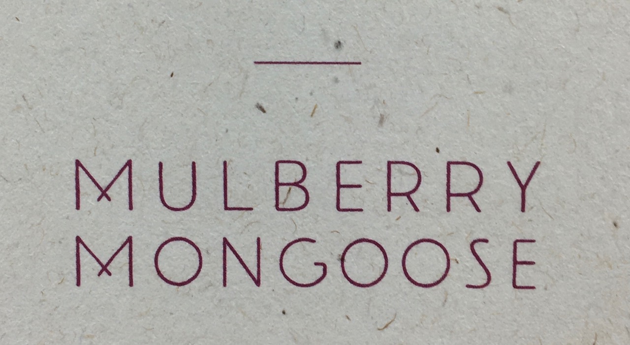
Who doesn't love a notebook ...?

This is a lovely series of promotional notebooks manufactured by Healeys Printers in Ipswich. Healeys are one of only ten carbon balanced printers working with the World Land Trust (the same organisation we work with, when we supply carbon offset paper) and have been since 2013. They are also FSC accredited and a member of the Two Sides campaign group.

This collection of notebooks highlights their commitment to the environment and uses the Crush range, manufactured by Favini and supplied by Fenner Paper in the UK. The paper is made partly using the residue from the industrial processing of crushed citrus fruit, coffee, nuts, olives, kiwi, corn, lavender cherries and grapes, these agro-industrial "end of life" products replacing up to 15% of conventional tree pulp.
The notebooks are A5 (210x148mm) portrait, with  4pp cover and 28pp text. The covers are on a variety of different shades in 250gsm and the text pages are printed on Crush, Corn 100gsm.
Intro pages...
Click on images to enlarge
You'd be right in thinking that there's not much to write about a notebook, after all it's just ruled lines...
...but you'd be wrong, as the singer sewn binding is superb!
Everyone loves Singer sewing!
Click on images to enlarge
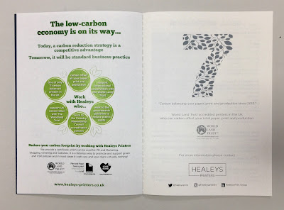
There are also a couple of pages of useful information about print and paper:
...and the World Land Trust endorsement:
A couple of other things worth pointing out. The paper for the text pages is 100gsm, which is the right weight (or lighter) for a notebook, otherwise you don't get enough pages in the book and it could also 'gape' in the inside spine of the book, which as you can see, this book sits nice and flat.
The books which are printed on deep shades are printed using Healeys digital white toner, as you can see on the cover below. Digital white toner is a much more cost effective solution than white silkscreen, hot foiling or other methods of digital white printing and the results are great...
The notebooks have been produced during the lockdown period and are being sent out now a part of a marketing campaign focusing on Healeys commitment to the environment.

https://healeys-printers.co.uk/
https://www.worldlandtrust.org/
Posted by Justin Hobson 10.08.2020

Thursday 6 August 2020

Number One

Number One is a Michelin-starred restaurant situated in The Balmoral, the Rocco Forte hotel in Edinburgh. Head Chef Mark Donald and his team have developed a menu fusing modern Scottish cuisine with international flair.

These are postcards which form the suite of literature for the restaurant. Size of the 2pp cards is 180x105mm.
Omnia was chosen because it would work with the rich detail that is present in the images but that would still give a natural look and tactile feel. As you can see from the images, the photography is quite dark, but there is no loss of detail, which is what can often happen printing on an uncoated paper - just look at the detail image below...
Omnia 280gsm is a very bulky board with a thickness of over 400microns, so perfect for a stand alone postcard.

Design is by Edinburgh based branding and design studio, Wolffe. Printed offset litho on Omnia 280gsm by Allander in Edinburgh.

https://wolffedesign.com/
https://www.allander.com/
Posted by Justin Hobson 06.08.2020

Tuesday 4 August 2020

Jobs from the past - Number 129

Regular followers of this blog will know that my first post of every month is a "job from the past" so that I can show some of the really good work from years gone by and this publication is from 2016.
 
Money Talks - The Great Swindle by Santiago Montoya

In February 2016, contemporary Colombian artist, Santiago Montoya, presented Money Talks at the Halcyon Gallery, London, which incorporated his mid career museum retrospective The Great Swindle. Montoya reinterprets paper currency as both a canvas as well as a raw material, exploring the added value beyond its very surface. Montoya’s use of money as an artistic medium, also opens a dialogue on the void between state propaganda and reality itself.
This is the literature which presents the work of Santiago Montoya by the Halcyon Gallery in collaboration with AMA (Art Museum of the Americas) in Washington ...and yes, it looks like a bundle of cash!
This wonderfully deceptive design is actually 48pp folded broadsheet. It is concertina folded vertically and horizontally. The flat size is 398x625mm folding down to 157x65mm and gives the 'wad' of notes a thickness off 4mm. The below image reveals the reverse side.
Click on images to enlarge
In this below image you can see the whole dollar side of the sheet unfolding...
Click on images to enlarge
Above is the dollar side and below is the story about The Great Swindle with a foreword by the Curator José Luis Falconi:
Click on images to enlarge
For would be forgers out there, you will be interested in knowing that this piece of literature is printed on Redeem 100% Recycled 80gsm and is printed offset litho, CMYK on both sides and as you can see from the detail image below the print result is excellent. Redeem is an uncoated paper with a wonderfully neutral tone that somehow gives a lot to the right publication.
The paper band or what is called a "currency strap" in the US, around a 'wad' of notes which is around 4mm thick, finishes the deception perfectly.
Design is by the team at the Halcyon Gallery and the printing and finishing is by Push Print based in London with Anthony Dearlove handling the project.

https://www.halcyongallery.com/
http://www.push-print.com/
Posted by Justin Hobson 04.08.2020