Showing posts with label Redeem 100% Recycled. Show all posts

Tuesday 2 March 2021

Jobs from the past - Number 136

Regular followers of this blog will know that my first post of every month is a "job from the past" so that I can show some of the really good work from years gone by and here's one from 2003.

The Fourth Estate Catalogue 
January-June 2003

The Fourth Estate is a publishers that many people will be familiar with. Founded by Victoria Barnsley in 1984, Fourth Estate built a reputation as one of the most innovative and eclectic imprints in the industry, with a reputation for publishing a wide variety of critically-acclaimed and beautifully-produced titles including many prize winning authors (Booker, Orange etc).

One of the things that made the Fourth Estate stand out from the crowd was their catalogues - they were simply amazing pieces of design and print! I was lucky enough to work on a few different catalogues in the late 90's and early 2000's. Every single one was different and brilliant. Good designers were commissioned, Bogue & Hopgood, Instinct, Pentagram, Rose Design, Frost, Neville Brody, Tom Hingston to name a few. In line with their reputation for publishing unconventional yet innovative titles, the design of the catalogue was equally eclectic.
The design and art direction is by Vince Frost with the superb illustrations by Marion Deuchars. This is a very special project where the creative direction, excellent execution of the images and high production values all come together.
The illustrations by Marion Deuchars were created using Carbon Paper. If you aren't familiar with carbon paper, it is the original way to make a copy on a typewriter, the impression from the top copy being made on an underneath sheet. So these wonderful illustrations are already second generation copies.
The size of the book is 225x160mm, portrait. It has an 4pp cover and a 88pp text and is printed on on our Redeem 100% Recycled 315gsm cover and 130gsm text.
The book is printed one colour, halftone, throughout and it is printed with all the imperfections that the carbon paper produces as you can see from the detail image below...
Most of the images are just illustrated on the left hand side but some of the pages are illustrated across the spread.
Pages 61-80 include just listings:
...and pages 81-87 is the backlist:
Below shows the 8mm spine with the neat perfect binding.
The 88pp text flows well and the pages turn nicely in the hand.
The covers and inside cover spreads are made using scans of the carbon paper used by Marion, which are composite images and look great.
Design and art direction is by Vince Frost. Illustrations by Marion Deuchars. Printing is by Principal Colour in Kent.

So, where is everybody now?.... Victoria Barnsley, founder of Fourth Estate, joined Harper Collins as CEO and Publisher in 2000 when it acquired her company, leaving in 2013. Marion Deuchars is a very popular illustrator and has recently published some instructional art books. Vince Frost left for the sunnier climate of Australia around eighteen years ago and runs Frost* in Sydney. Principal Colour are in Paddock Wood in Kent and Fenner Paper? ...yep, we're still here! 

Posted by Justin Hobson 02.03.2021

Tuesday 3 November 2020

Jobs from the past - Number 132

Regular followers of this blog will know that my first post of every month is a "job from the past" so that I can show some of the really good work from years gone by and this publication is from the noughties. 

The Chase - 2004
From humble beginnings in a Manchester suburb, the Chase began with the ambition of providing a level of creativity that challenged the dominant London design groups. Now 34 years on, they are one of the most awarded creative consultancies in the world. Ben Casey (co-founder) still oversees The Chase and is also Professor at the University of Central Lancashire.  
This newspaper style format is a large finished size at 420x310mm and is a 12pp self cover, saddle stitched.
Click on images to enlarge
It is printed Offset Litho on our Redeem 100% Recycled 100gsm which is has a neutral white shade which gives the publication a 'newspaper' feel which really suits the editorial work that is being shown and which prints amazingly, as I hope these images show...
This publication was produced around the time that Harriet Devoy left Johnson Banks to join The Chase and set up the new London office. Since running the London office, Harriet joined Apple and was D&AD president last year. 
Below image shows the way the 12pp text sits nice and flat...
The publication isn't as light as a newspaper but it flows freely in the hand.
Design is by The Chase. I think it was printed by the New Leaf Press in Manchester, who have since closed.

Posted by Justin Hobson 03.11.2020

Tuesday 1 September 2020

Jobs from the past - Number 130

Regular followers of this blog will know that my first post of every month is a "job from the past" so that I can show some of the really good work from years gone by and this publication is from 2008.

Absolute Radio - Launch Brochure 2008
On June 30th 2008 TIML took over Virgin Radio and re-branded the station as Absolute Radio. This publication was the launch document produced for the press, employees and advertisers.
This newspaper style publication is a large format 420x297mm (A3) portrait and is a 24pp 'self-cover' left completely unbound.
Click on images to enlarge
It is printed on our Redeem 100% Recycled 100gsm which is has a neutral white shade which gives the publication a 'newspaper' feel which really suits the editorial work that is being shown and which prints amazingly, as I hope these images show...
Click on images to enlarge
Below is a detail image showing just how good the images look...
...and the below image shows the binding (or lack of it!) with the text all loose, so you can see the way the 4pp sections sit together...
Below image shows the way the 24pp text sits nice and flat...
Outside back cover:
The publication isn't as light as a newspaper but it flows freely in the hand.
Sadly I don't know who to credit the design and creative work to (if you know, please drop me a line), however I do know that Principal Colour in Paddock Wood did the printing. Printed offset litho, CMYK throughout.

https://www.absoluteradiotickets.co.uk/
http://www.principalcolour.co.uk/ 
Posted by Justin Hobson 01.09,2020

Tuesday 4 August 2020

Jobs from the past - Number 129

Regular followers of this blog will know that my first post of every month is a "job from the past" so that I can show some of the really good work from years gone by and this publication is from 2016.
 
Money Talks - The Great Swindle by Santiago Montoya

In February 2016, contemporary Colombian artist, Santiago Montoya, presented Money Talks at the Halcyon Gallery, London, which incorporated his mid career museum retrospective The Great Swindle. Montoya reinterprets paper currency as both a canvas as well as a raw material, exploring the added value beyond its very surface. Montoya’s use of money as an artistic medium, also opens a dialogue on the void between state propaganda and reality itself.
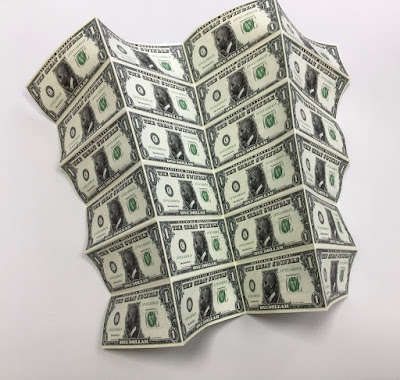
This is the literature which presents the work of Santiago Montoya by the Halcyon Gallery in collaboration with AMA (Art Museum of the Americas) in Washington ...and yes, it looks like a bundle of cash!
This wonderfully deceptive design is actually 48pp folded broadsheet. It is concertina folded vertically and horizontally. The flat size is 398x625mm folding down to 157x65mm and gives the 'wad' of notes a thickness off 4mm. The below image reveals the reverse side.
Click on images to enlarge
In this below image you can see the whole dollar side of the sheet unfolding...
Click on images to enlarge
Above is the dollar side and below is the story about The Great Swindle with a foreword by the Curator José Luis Falconi:
Click on images to enlarge
For would be forgers out there, you will be interested in knowing that this piece of literature is printed on Redeem 100% Recycled 80gsm and is printed offset litho, CMYK on both sides and as you can see from the detail image below the print result is excellent. Redeem is an uncoated paper with a wonderfully neutral tone that somehow gives a lot to the right publication.
The paper band or what is called a "currency strap" in the US, around a 'wad' of notes which is around 4mm thick, finishes the deception perfectly.
Design is by the team at the Halcyon Gallery and the printing and finishing is by Push Print based in London with Anthony Dearlove handling the project.

https://www.halcyongallery.com/
http://www.push-print.com/
Posted by Justin Hobson 04.08.2020

Friday 24 July 2020

The Medium's Medium

The Gallery of Everything is London's first and only commercial space dedicated to non-academic and private art-making. The gallery's roster includes major historical master artists and newly discovered authors and creators. A British non-profit organisation, committed to the advancement, integration and celebration of artists and makers beyond the cultural mainstream.
Last year they presented an exhibition titled 'The Medium's Medium' a two part exploration into spiritualist and mediumistic art practices from the 19th century to the present day.

This is the catalogue which accompanied the exhibition and features drawings and paintings by a diverse range of authors, from established names to newer (re)discoveries. The catalogue is produced in the style of a 19th century pamphlet or chapbook as they are sometimes called.
Size is 210x165mm, portrait and is a 60pp 'self cover' which is saddle stitched. It is printed on our Redeem 100% Recycled 60gsm, which is a neutral white shade, which has the perfect tone for a 19th century publication and the 60gsm weight means it flows and flops perfectly...
It is printed offset litho throughout and the majority of pages are just printed in black only.
However, towards the middle of the publication, the drawings and paintings are reproduced with amazing clarity...
Click on images to enlarge
Centre spread, below
A lovely feature is the use of copper wire for the saddle stitches:
The 60gsm weight is just perfect for the publication.
...and even though this is a 60pp, the thickness is only 2mm! and it doesn't 'gape' in the spine as a heavier paper would, as you can see in the below image.
Print is by Identity Print, based in Paddock Wood with Paul Martin handling the project. You can read more about the exhibition here.

https://www.gallevery.com/
http://www.identityprint.co.uk
Posted by Justin Hobson 24.07.2020