Tuesday, 19 February 2019

Freda Sack

Last week it was announced that British type designer Freda Sack died. Freda had a long career starting at Letraset in the 1970's followed by a host of other groundbreaking type design companies. Eventually Freda went freelance and then collaborated with David Quay setting up The Foundry together. Over her long career, Freda is credited with a large number of typeface designs which I shall not attempt to list here.
Freda was deeply involved in education, both as a governor and external examiner. From the mid 1990's she was heavily involved with the smooth running of the International Society of Typographic Designers (ISTD) in a variety of roles, culminating with being President from 2006-2010.

Last Summer, Freda was made an Honorary Fellow of the ISTD in recognition of her significant contribution to the Society and the typographic industry. The award was made at the ISTD 90th anniversary, which I wrote about here and where I took the rather over-exposed picture above.

It was a pleasure to know Freda and she was a tireless worker for the causes she was involved with. She was always giving and yet so appreciative to others for their efforts. Freda was a fellow member of the Wynkyn de Worde Society and I was honoured to have her as my guest at last year's Summer party, where she kindly gave me a wonderful 'sign of the sun' brooch, which I treasure.

You can read more about Freda's life here:

Freda touched many lives and will be sorely missed by all who knew her.

https://www.istd.org.uk/
http://www.foundrytypes.co.uk/about-the-foundry/the-foundry-partners/freda-sack
Posted by Justin Hobson 19.02.2019


Friday, 15 February 2019

WEDF - Give it a Whirli

On Wednesday evening, I went to one of the best talks on design and branding I've ever been to. The West of England Design Forum (WEDF) was founded in 2006 to champion design in the West of England. It's a volunteer run organisation which has created a place for local design industry people to meet, share ideas, be inspired and make connections. Every month or so, they have an industry insider or company to talk about their work.

The talk on Wednesday was by Ragged Edge, a branding agency in London. What made this talk different (and so brilliant) is that they focused on one project, called Whirli, taking the audience through the process step by step, with individual talks by the co-founder (Max Ottignon), the strategist, the writer and the creative director - each presentation punctuated by the reaction by the actual client!
Yes, Nigel Phan, founder of Whirli and the actual client, spoke after each of the presentations and gave his reasoning and insight into which routes he decided on and why - and Max even took the opportunity of asking Nigel how much budget played a part in the decision making!

This talk, broke the usual mould of a design company talking about where they went to uni, their first job, how they set up, what projects they did etc etc. The result was a fascinating and really insightful talk - and very well presented.

It was an excellent evening and the WEDF should be applauded for their program of events and the quality of speakers that they have managed to get - well done to all those volunteers at the WEDF involved in organising these events.

https://raggededge.com/
https://wedesignforum.co.uk/
https://whirli.com/
Posted by Justin Hobson 15.02.2019 

Thursday, 14 February 2019

Valentine's Day

Happy Valentine's Day! What could be better than showing you a superb card, produced on our Flockage Colours...  
In fairness, this card was produced a couple of years ago by Blue Eyed Sun, so it's not now currently available, however it really is a beautifully luxurious card.

For those of you which are not familiar with this product, it is a flocked board which feels like a velvety cloth/material to the touch. It also takes hot foil blocking exceptionally well as the heat, softens the fibres allowing the foil to bed down nicely in the flock.
Flockage is a one sided material - in the case of the Bright Red, it has a coloured flock face and a red coloured board reverse.
As you will be able to see from the image above, the material has been properly creased with a 'matrix' crease, forming a perfect fold. Reverse of the card, also foiled, is below.
The cards are designed and published by Blue Eyed Sun. Design is by Jo Corner. Blue Eyed Sun is an award winning greeting card company based in Brighton established nearly twenty years ago. They specialise in handmade and high end design-led cards, which are now sold around the world by some of the best know retailers including Harrods, John Lewis etc.

Joint founder and managing director Jeremy Corner is a leading figure in the greeting card world. He is instrumental within the 'Ladder Club' which helps aspiring greeting card publishers and is on the council of the Greeting Card Association (GCA). He is a real advocate for the industry ...and he still finds time to be a regular blogger!

www.blueeyedsun.co.uk
Posted by Justin Hobson 14.02.2019

Monday, 11 February 2019

Landmark

Landmark is a Samuel Heath collection consisting of two Bauhaus-inspired designs and this is a superb piece of literature produced to show the restrained minimalist design and to fully communicate its craftsmanship and depth of inspiration.
I cannot describe the project better than on the Sanders website..."The challenge of this project was to present the product collection in a clear and precise manner, whilst ensuring design language and ease of use remained true to the Bauhaus principles that inspired the initial sketches of the product design. The use of carmine colouring boldly compliments the pure white texture throughout and the photography used has minimal shine and shading which bequeaths an understated confidence and stays true to the industrial aesthetic established. Implementing both of these themes we stayed true to the Bauhaus brilliance used to formulate the original design"

... and this is quite true! It is one of the most beautiful and well produced pieces of literature to appear on this blog (in my opinion!)
Size of the brochure is 297x245mm, portrait and is saddle stitched with a 4pp cover and 16pp text. It is printed on our lovely Omnia 320gsm (cover) and 200gsm (text). The carmine special colour is flat, matt and tactile just like you would want it and with a real depth and intensity of colour.
As the Sanders introduction states, the design had to be simple and superbly executed and the cover is the perfect demonstration. Along the spine there is a 45mm band (front and back cover) which is printed in the Carmine and blind embossed, perfectly simulating a cloth binding tape. The result is simply stunning...
Our Omnia was chosen which gives it that dead matt, tactile feel but with great reproduction, the solids are quite simply stunning.
As you can see from the images, there is lots of colour and images with CMYK dark areas - loads of ink going down and it looks great on the Omnia, reproducing bright vibrant solids, whilst retaining detail in the dark areas (in my opinion- but I would say that wouldn't I?)
The outside back cover - with the 45mm embossing running parallel to the spine. 
Creative direction and design is by Sanders Product Design & Branding and the designer on the project is Jameila Thomas. Printing is by Leicester based Greenshires with Rob Hughes handling the project. The publication is printed offset litho in CMYK plus a special red. Printing and finishing are superb - a really well produced piece.

https://landmark-collection.com/
https://www.sanders-design.com/
http://www.greenshires.com/
Posted by Justin Hobson 11.02.2019

Thursday, 7 February 2019

Notey or Nice?

Studio Small are a London based studio, specialising in the fashion, design and luxury sectors. Every year they produce a Christmas card, but rather than just producing a a clever card, they always produce something a little unusual and hopefully useful. This last Christmas it was this lovely notepad...
The pad is A5, size and includes 80 plain leaves (160pp) on which to write.
Click on images to enlarge
The cover of the pad is simply silkscreened in three colours (white ink and two fluorescents) on our Colorset, Bright Red 350gsm. The front is pictured above on the left. On the back of the pad is printed the Christmas greeting.
The pad is glued at the top - the term for this is 'glued at the head'. The text pages are using our Redeem 100% Recycled 60gsm.
The pad is bound using "Padding Glue", so the sheets can be torn off easily. The image below shows the glued head and the perfectly creased spine...
Binding is by Wayte Binding who are based in Tunbridge Wells.
Design is by Darcy Ward at Studio Small. The covers have been beautifully printed by Harvey Lloyd Screenprint, who are based in Wadhurst, East Sussex. It is worth having a look at their website for some of the great work they do for the likes of Anthony Burrill and Mr Bingo.

http://www.studiosmall.com/
http://harveylloydscreens.co.uk/
http://www.waytebinding.co.uk/
Posted by Justin Hobson 07.02.2019

Monday, 4 February 2019

Jobs from the past - Number 112

Regular followers of this blog will know that my first post of every month is a "job from the past" so that I can show some of the really good work from years gone by. This project is from the year 2000.

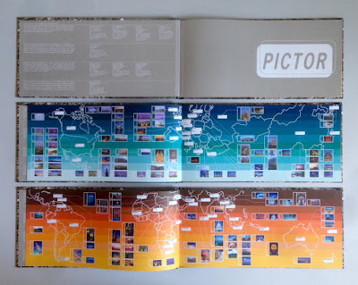
Traveller - Pictor.com
In the pre-internet age, if you wanted an image, you used to have to search through printed catalogues supplied by photo libraries. You would then either, phone, fax or even write a letter (!) ordering the transparency for which you would be charged. As digital technology developed, photo libraries were able to provide a larger volume of images on disc, but to promote the images from the library, they would often also send a book showing a selection of printed images. This is one such publication produced in the Summer of 2000, just at the time when the internet was enabling the exchange of digital files and at the time of the first dotcom boom.
It is an unusual format of 140x297mm, Landscape. It is section sewn and casebound with a 56pp text plus printed endpapers.
The images are of the highest quality and this publication is just to give a flavour of the bigger selection of images available on disk, so the first couple of pages show the areas in the world where the different sections have been shot...
Click on images to enlarge
The text is printed on Neptune Unique FSC 135gsm and looks truly amazing! Neptune is smooth uncoated with a high white shade and the images have reproduced amazingly (in no small way, due to the printer as well). Printed offset litho in CMYK plus a special pantone color for the printed end papers. At this time, most stock photography catalogues were printed on coated papers, so that reproduction was ensured, but at this time, although image reproduction was important, it was also important to show how images might look in use and it was at a time when the use of quality uncoated papers was becoming more prevalent.
In those days there needed to be a disc included as file transfer over the internet was still to come, so as you can see below, a disc affixed on the inside back cover...
Image showing the thread of the section sewing...
Creative direction and design is by the in house team at Pictor. It seems that Pictor no longer exists as a picture library, but I guess the world of stock image photography has changed beyond all recognition since the millennium.

The excellent printing and binding was by Fulmar, based in Croydon, Surrey and this project was handled by Keith Marley. Fulmar was a printer founded in 1971 by Mike Taylor and was a forward thinking, successful and large print group. Mike Taylor sold Fulmar in 2006 to the CPI group and they are still printing in the same factory and still producing lovely work!

Keith Marley now runs his own printing consultancy: http://keithmarley.co.uk/

http://www.cpi-print.co.uk/
https://bapla.org.uk/
Posted by Justin Hobson 04.02.2019

Thursday, 31 January 2019

Archerfield Gift Voucher

Fletcher’s Cottage Spa is the luxurious spa set on the Archerfield Estate, which is less than an hour from Edinburgh. The estate features a golf course and several houses which can be booked in their entirety for weddings and celebrations. The spa has been featured in the Sunday Times Travel Top 6 British Spas and the Tatler Spa Guide.
This is the printed gift voucher, the format is a 6pp, A4 gatefold with two "thumbcuts" which hold in the voucher (195x92mm) as you can see in the images below.
Click on images to emlarge
The below image shows the outer cover, flat.
This literature is all printed on Crush, Corn 200gsm. It has been digitally printed (beautifully) on a Ricoh 5100 by DTP Print in Edinburgh as you can see from the detail image below...
Creative direction and design is by Katherine Scott at Studio Thought Process based in Edinburgh.
 
If you aren't familiar with Crush, it is one of our ranges made by FAVINI in Italy and is made using 15% residues from the industrial processing of agricultural processing. As a result, the paper does have inclusions and a "rustic" feel, which you might just be able to see from the image detail below:
Click on images to enlarge
With thanks to Sonya Beaumont at DTP Print for sending file copies.

https://www.archerfieldhouse.com/spa/
http://studiothoughtprocess.com/
http://www.dtpprint.co.uk/
Posted by Justin Hobson 31.01.2019