Monday 15 June 2020

Picpus #22

Picpus is a free magazine edited by Charles Asprey and Simon Grant. It carries articles from the art world, with a particular interest in historical curiosities, overlooked artists, arts and politics and is distributed through a selection of specialised art bookshops, galleries and libraries.
The format of Picpus is a folded down broadsheet, measuring 594x420mm (A1 size) which folds down to a 32pp A6 (105x148mm) finished size.
Click on images to enlarge
Picpus is printed quarterly and this is issue 22 issue published in Autumn last year in memory of Karsten Schubert, publisher and gallerist (1961-2019). It is an edition of 4000 copies. Below shows the broadsheet folded out flat...
...and the reverse side
Picpus is printed on Redeem 100% Recycled 80gsm and is printed offset litho, CMYK on both sides and as you can see from the detail image below the print result is excellent.
Design is by Studio Ard and is printed by Push Print, who have printed every issue since it's inception. The publication is held together with a small round sticker with serrated middle, holding it flat.
http://www.charlesasprey.london/picpus-press.html
http://www.ard.works/
http://www.push-print.com/ 
Posted by Justin Hobson 15.06.2020

Thursday 11 June 2020

Invitation to Void

Presented as part of last year's London Design Festival, VOID is an installation by photographer Dan Tobin Smith and creative studio The Experience Machine, a multi-sensory spatial installation at Collins Music Hall, Islington.
A selection of Mozambican rubies and Zambian emeralds from their supporter Gemfields’ mines, which date back millions of years, were brought to life through photography of tiny microcosms magnified to become abstract, galaxy-like structures.
Click on images to enlarge
This is the beautifully produced private view invitation. Size is A5 landscape (148x210mm). The invitation face is is printed on our Colorset, Dark Grey 270gsm, heavily debossed (see above) and hot foil blocked in metallic black foil. Below, shows the detail of the hot foil blocking 
The invitation is triplexed, with the Colorset Dark Grey on the face, our Sumo Black 1.5mm in the centre and a HP Indigo printed reverse, giving an overall thickness of 2mm.
Different images from the installation were used on the reverse of the invitations, the below image shows two of the images...
Design is by Sandra Zellmer. The superlative print and finishing is by Brighton based Generation Press, who are unusual in having litho, digital, letterpress and hot-foiling all in house.

https://www.londondesignfestival.com/event/void
https://gemfields.com/
http://www.sandrazellmer.com/
https://generationpress.co.uk/
Posted by Justin Hobson 11.06.2020

Monday 8 June 2020

Hotel de Russie - Rome

Located between two of Rome’s most picturesque piazzas, Piazza di Spagna and Piazza del Popolo, Hotel de Russie is one of the Eternal City’s most prestigious luxury hotels. An enduring favourite of artists and writers, stars and politicians, Hotel de Russie was dubbed “paradise on earth” by French poet Jean Cocteau in 1917. The hotel incorporates a stunning Mediterranean tiered Secret Garden, with rose bushes, orange trees and mature pine.

This the brochure for the hotel, which follows the new brand identity for Rocco Forte Hotels, created by Pentagram.
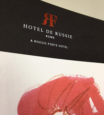
Size of the brochure is 266 x 204mm, portrait and is saddle stitched. The cover is an unusual format as there is an 8pp cover with 140mm wide flaps and there is an outer jacket, only 210mm high, also with 140mm flaps. It is the first time I've seen this combination and the effect is superb...
Click on images to enlarge
The materials used for the covers is our Dali range, which is a 'felt-marked' paper with a linear effect and a natural, tactile feel. If you click on the image below, you will be able to see the texture in the paper.
Click on images to enlarge
The cover is on Dali Nero 200gsm and is hot foil blocked in matt white and copper foil. The jacket is printed on Dali, Candido, 160gsm and is litho printed in CMYK on one side only.
Click on images to enlarge
The 16pp text is printed offset litho on our Marazion Ultra 135gsm, chosen because of it's dead matt flatness which would reproduce the interior images well without a glossiness which would detract from the classic look and feel of the hotel.
click on images to enlarge
The brochure has a beautiful, quality feel and flows in the hand superbly. The combination of photography, materials and quality print makes this a wonderful piece of print.
Design is by Pentagram. The excellent print, repro and finishing is by Gavin Martin Colournet, based in Greenwich, South London.

https://www.roccofortehotels.com/hotels-and-resorts/hotel-de-russie/
https://www.pentagram.com/ 
https://www.gavinmartincolournet.co.uk/
Posted by Justin Hobson 08.06.2020

Saturday 6 June 2020

St Bride Virtual Wayzgoose - TODAY!

Last month, on 17th May it would have been the 6th annual St Bride Foundation WAYZGOOSE organised by Mick and Gill Clayton. For obvious reasons with the Covid lockdown, it was cancelled. A Wayzgoose is a term (unfamiliar to most people) that used to refer to an annual holiday in a print-works and was often an away-day to the coast or some other sort of day out, more often than not, paid for by the firm. In this instance the St Bride Wayzgoose is a kind of letterpress 'bring and buy' sale.
It was very sad that it was cancelled as every year, it is a chance for quite a large number of people to get together, as you can see from a picture below from a previous year...
Thanks to Becky Chilcott, a stalwart volunteer at St Brides, there is a 'virtual wayzgoose'  - TODAY.  It is made up of many people who would normally attend the Wayzgoose, who have all made 2 minute videos, including yours truly...
All videos will be available to watch on their Vimeo account from 8am today and will be sharing them throughout the day every half an hour on Twitter (with regular cake breaks!) until 8pm.
The video channel is: https://vimeo.com/stbride
...and the wayzgoose always requires Cake!

Every year I run the Fenner Paper stall, where we sell offcuts and leftovers with the money raised donated to the St Bride Foundation. Last year we raised a record breaking £357! For interest, this is the way my 'non-virtual' stall usually looks...

https://vimeo.com/stbride/
https://www.sbf.org.uk/
Posted by Justin Hobson 06.06.2020

Friday 5 June 2020

Beaming

This is a really lovely piece of sales literature designed to work as a handout or a mailing piece. It has a lovely quality feel and is produced with high production values which show throughout.

Beaming is an established Internet Service Provider for businesses across the UK. They deliver reliable voice and data services and provide ongoing support ...and they're not afraid to say that they think they're the best!
The finished size is 210x128mm, portrait and the content is 12pp. Below is a birdseye view showing the way that it opens in the conventional way...
...and the below image shows the way the 8pp inner "text" concertina's into a 4pp "cover" which has been formed by parallel creases.
 ...and below is the parallel crease which forms the spine
Spine, as below (without the inner pages concertina'd inside)
The flat size is 210 x 760mm and below shows the outside, spread flat...
...and the inside
The material chosen for the publication is our Omnia in 200gsm and is printed offset litho in CMYK. For those readers not familiar with Omnia, it is an uncoated paper with a surface treatment. What this means is that it feels like an uncoated paper but because the surface treatment minimises 'dot-gain', the print result is much more like that of a coated silk or gloss coated paper. You can see the result - the solid red looks so vibrant and the tactile quality really works with the illustrations. Omnia also has a high bulk, so although this is only a 12pp it feels much more substantial.
It is a simple format and because it has been produced and finished superbly, it is beautiful. The publication is designed by Playne Design who have studios in London and Hastings. Creative Director is Clare Playne with production is handled by Simon Hack. The excellent printing and finishing is by Pureprint.

https://www.beaming.co.uk/
https://playnedesign.co.uk/
https://www.pureprint.com/ 
Posted by Justin Hobson 05.06.2020

Tuesday 2 June 2020

Jobs from the past - Number 127

Regular followers of this blog will know that my first post of every month is a "job from the past" so that I can show some of the really good work from years gone by and this publication is from 2016. 

LCC - Design for Visual Communication (DVC) 2016

This publication reviews the work of 56 students who have undertaken the Postgraduate Certificate and Diploma in part-time and full-time modes at the London College of Communication (LCC) during 2016. The introductory section includes two features related to design activism and is illustrated using images taken from student submissions to the ISTD student assessment.

Size of the publication is 240x160mm (an oversize A5 which is economical to print using 'B'size paper). The cover design is by Caley Dewhurst and is letterpress printed at the LCC letterpress department by Christian Granados and Alex Cooper.
The 4pp cover is printed on our Colorset (100% Recycled) Light Grey 270gsm and printed in three colour letterpress.
The 64pp text is printed CMYK offset litho at the LCC litho printing department by Tony Yard and the result is excellent. The first pages are for the DVC Postgraduate Certificate
Click on images to enlarge
The second section is for the DVC Postgraduate Diploma...
It's also worth pointing out that one of the students on this course, Chia-Lin Lin (see r/h page below) was awarded the prestigious Vincent Steer prize at the ISTD Student Awards in that summer which you can read about here.
Click on images to enlarge
StarFine is a quality, uncoated paper and as the images show, image reproduction is excellent. The photographic images, montages and illustrations all look equally stunning - a great amount of detail for an uncoated paper.
64pp of StarFine 115gsm is about the maximum that you can successfully saddle stitch without it "gaping" in the centrefold too badly. This publication works but it would be a struggle if there were any more pages....
You can see below the "matrix" crease that means that the cover has been really well finished so that the cover sits as flat as possible and there's no cracking along the spine. Print finishing was also in-house at the LCC by Scott House.
The course leader is Tony Pritchard and this is an excellent example of a high quality publication that can be produced when like-minded individuals come together and in house facilities exist and have been fully utilised.

www.arts.ac.uk/lcc
https://www.istd.org.uk/education/2020-student-briefs
Posted by Justin Hobson 02.06.2020