Friday 11 December 2020

Cards - Made by Shannon

One of the great pleasures I have doing this job is receiving lovely things in the post and last week, I received a lovely selection of cards from Made by Shannon...

This greeting card publishers is run by a lovely lady called Shannon and they are based in Surrey. The below card is printed on our CRUSH Grape 250gsm
Click on images to enlarge
Above is a more detailed image and hopefully you can see the small specs and inclusions in the paper. Crush is made partly using the residue from the industrial processing of agro-industrial "end of life" products replacing up to 15% of conventional tree pulp. The 15% process residues are combined with 40% recycled fibres (post consumer waste) and the remainder is FSC virgin pulp and the product is FSC certified. The range is produced using green energy and is carbon balanced at the mill gate (we can also supply the paper in the UK, certified as carbon balanced)
The A6 cards are printed and hot foil blocked in-house, where they have letterpress and a 1980's hot foil blocker which is used on cards and envelopes. However, they also sometimes just hand apply gold leaf as you can in the small embellishment below.
The above SIXTEEN TODAY card is printed on our Colorset Storm 270gsm. The beautifully hot foiled envelopes are made using Colorset Storm 120gsm.
...which also have a superb embossing on the flap:
At this time of year, personalised Christmas cards are in great demand and below is an example printed on our CRUSH Kiwi 250gsm.
Click on images to enlarge
Thank you to Shannon for sending me this selection and if you would like to see her range of cards and gifts, you can see them HERE.

Tuesday 8 December 2020

Fenner Paper 2021 Diary

I am pleased to reveal the Fenner Paper 2021 Diary...
As in previous years, the diary is 230x162mm, portrait and retains the popular 'month to view' format. The cover board is printed offset litho in just one colour - silver pantone colour 877 on both Colorset Charcoal and Colorset Deep Blue 270gsm.
This year the diary has been designed by David Coates, independent designer and board director of ISTD.
The 40pp text is typeset in Foundry Tiento and Foundry Unie from The Foundry Types and is simply printed in one colour, offset litho, on our lovely Offenbach Bible 60gsm, which has a superb opacity and a good writing surface making this an ideal paper for a diary or notebook.

If you are one of our worthy clients (!), you should be receiving one of our diaries in the post but if you would rather have it sent to your home than the office or if you want to make sure you are in our address book, drop me an email: justin@fennerpaper.co.uk
Posted by Justin Hobson 08.12.2020

Friday 4 December 2020

Christmas Crackers using Crush Corn

Luisa Vicinanza-Bedi only started learning how to make bean to bar chocolate in 2017. Since then she has established her own shop Luisa's Vegan Chocolates based in Sneinton Market, Nottingham and has a strong online presence. Luisa has also picked up a handful of awards at the Academy of Chocolate including  ‘UK Rising Star’ in 2019.
Photographs courtesy of Luisa's Vegan Chocolates
As part of Luisa's special Christmas offerings, there are these yummy Christmas Crackers - packed full of goodies and all products happen to be vegan too!
Photographs courtesy of Luisa's Vegan Chocolates
These beautiful crackers are printed on our CRUSH range of papers, made using 15% agro-industrial residues combined with post consumer waste and virgin fibre (all FSC accredited). The cracker body is using Crush Corn 200gsm and the chocolate box wraps are 120gsm. They are superbly digitally printed and foiled by Rose Press in Nottingham, who usually specialise in Wedding stationery.
Photographs courtesy of Luisa's Vegan Chocolates
Luisa's Vegan Chocolates is the first and only Bean-To-Bar chocolate maker in Nottingham, taking her chocolate through the delicate artisan process by hand. Luisa directly sources her beans to pay her farmers a better than FairTrade price for their crop, at least double the standard market rate which is wonderful.

So in this year of the online Christmas Shopping, how about supporting an ethical small enterprise?... and what better present to get your Mum, Dad, Aunt, Uncle, Grandma, Children etc etc - You can buy online HERE.

Posted by Justin Hobson 04.12.2020

Wednesday 2 December 2020

Jobs from the past - Number 133

Regular followers of this blog will know that my first post of every month is a "job from the past" so that I can show some of the really good work from years gone by. Given the sad news this week that the Arcadia group has gone into administration, I thought I'd show you this superb project for Topman which is part of Arcadia.

Topman - Spring/Summer 2011

Topman is the Arcadia group's fashion conscious male brand and this piece of literature is produced to the very highest standard with superb art direction, photography and print reproduction - and a few little tricksy surprises lurk within as well!
This lookbook is 350x280mm, portrait format which is just a lovely size - different (not uneconomical either) but just feels right for it's sub A3 and slightly squarer format.
The piece has a 4pp cover and a 68pp text and is perfect bound.
It is printed offset litho in CMYK throughout - colour reproduction is fantastic - solid flat areas of colour work amazingly well as do the mono images. The sense of space in the job is fantastic - the spread below has a completely blank page - an excellent unhurried piece of design for print. 
...and here's for the surprise (well three of them actually). There are three smaller (310x230mm) right hand page "throw outs" with closer up detail shots. These are printed on our high gloss, one sided cast coated paper Astralux 115gsm. The images are printed on the gloss side (see below) and the uncoated reverse (see above pic) is printed in a flat solid cool grey.
The below image shows the flat uncoated reverse side of the Astralux, printed grey over the high gloss face side with the CMYK images...
The 68pp text is printed on our Omnia 120gsm which gives it that dead matt, tactile feel but with great reproduction - let the pictures do the talking...
Below is the detail image showing the fantastic reproduction on the Omnia:
For me, one of the joys of this piece of literature is the way it easily flows in the hand. Many designers will use a really heavy cover when producing a document with a substantial number of pages and this can cause disruption with the way the cover interacts with the text - it can be way too flicky! The cover of this job is 200gsm - it is on Omnia, which is a bulky material, but it is the perfect weight.
The cover is beautifully hot foiled blocked in gloss white foil.
...and if that wasn't enough the whole book is inserted into a custom made capacity envelope, also made out of Omnia 200gsm.
Art Direction and design was by Gill Patchett who worked in-house at Arcadia. Production was by Stephanie Johnson. Photographer is Boo George  with production at Streeters. Printing was by Ortek printers in Walsall. Gill very kindly sent me some file copies:
So what are people doing now? Arcadia has gone bust this week. Sadly Ortek Printers went bust back in 2017. Gill Patchett is now a freelance Art director and Designer ...and Fenner Paper? yep, we're still here doing good stuff!


...and if you'd like to read my original post about this job from 2011 and see how my powers of description and prose have improved, you can read it HERE.
Posted by Justin Hobson 02.12.2020

Sunday 29 November 2020

St Bride Foundation 125th Anniversary

As many readers of this blog will know, this month the St Bride Foundation celebrates their 125th anniversary. To coincide with this, they are running a crowdfunding campaign to raise money for the Foundation to fund a year of special events (throughout 2021) and most importantly the beginning of a project to digitise the extensive Library enabling the collections to be shared with the global audience they deserve.

It brought to mind a fantastic project for the St Bride Foundation which I was involved with last year which I never wrote about but now having plagiarised (with permission!) the excellent blog article by Alistair Hall of We Made This, here it is...
Fourteen artists, designers, writers, illustrators and musicians were asked if they would collaborate in pairs to each create a poster designed to celebrate and highlight the rich and varied collections held within the St Bride Library and the building itself. The Collections and Collaborations project culminated in an evening to celebrate their work and the items from the collections that inspired them. The private view, held last May, included a series of short lectures from some of the collaborators about the process behind their work.
The collaborators are: 
Catherine Dixon & Mick Clayton 
Pam Smy & Ness Woo
Bob Richardson & Alistair Hall
Tom Gauld & John L. Walters
David Pearson & Paul Barnes
Anil Aykan & Jonathan Barnbrook (Fragile Self)
Tom Etherington & Keith Houston

There are 7 posters in total, each printed in an edition of 60, all printed on papers supplied by Fenner Paper and all printed Offset Litho by Boss Print ...and what a set it is!

Designer, writer and teacher Catherine Dixon worked with freelance type compositor Mick Clayton, who manages the St Bride Print Workshop. They went the extra mile – well, several extra miles to be honest – and letterpress printed their creation in the print workshops at the library, onto Shiro Echo, White 160gsm. It features a collection of ‘lost words’ from the printing trade.
Click on images to enlarge
Book designer Tom Etherington, from Penguin Press, working with author Keith Houston, who wrote the fantastic books Shady Characters and The Book, created this fantastic print...
Click on images to enlarge
The image above doesn’t really capture the brilliant way it’s been printed though. All the grey text is actually printed in black on the reverse side of the poster, showing through the semi translucent 60gsm Sixties stock, as you can see here:
The type on the above poster is set in Commercial Type’s Thorowgood Grotesque and Caslon Doric Wide.

Anil Aykan & Jonathan Barnbrook from Barnbrook Studio are also musicians and have just released their first self titled Album ‘Fragile Self’. They took a set of song lyrics from a broadside they found in the library, and created this contemporary version, featuring a bespoke typeface...
Click on images to enlarge
I discussed the poster with Jonathan and the concerns about the dark image and how it was important that the reproduction retained it's detail, which is why we decided on using Omnia 150gsm, which would reproduce the image without losing clarity.

Illustrator and teacher Pam Smy teamed up with book designer and lecturer Ness Wood (together with Maisie Paradise Shearring they make up Orange Beak Studio), and created this print based on the work of Beatrice Warde, printed onto Pergraphica Smooth, Natural 120gsm.
Illustrator Tom Gauld was paired with John L. Walters, author, musician, and editor of Eye magazine. John wrote a piece about the experience of visiting St Bride Library, and Tom created this stunning print around it. It’s printed onto Gardapat 13, Klassica 115gsm.
Click on images to enlarge
Here’s a detail...
Book designer David Pearson, worked with type designer Paul Barnes from Commercial Type, showcasing some more types from Commercial Classics. The posters were printed onto different shades from our Colorset range in 120gsm, the below image printed on Colorset Solar...
...and last but by no means least, here is the poster by Alistair Hall and Bob Richardson. After research in the Library, Alistair was inspired by the incredible elongated sans serif typefaces fom the R D DeLittle “Eboracum” Letter Factory. The finished result uses the Colophon Foundry’s recently released Coign type family and was printed on our Creative Print Champagne 170gsm
Click on images to enlarge
The below image shows the set of posters for sale during the launch evening. Some of these posters are still available and you can buy them HERE. Each poster has been produced in a limited edition with all profits going to the St Bride Foundation.
The project would never have been possible if it were not for the support of Boss Print who donated the printing, which was no small thing. Also, I must mention Becky Chilcott, the organiser, without whom this event would never have happened and my thanks again to Alistair Hall for allowing me to use the images and copy from his blog.

During this crowdfunding campaign, what better way to remember why the St Bride Foundation is such a valuable resource? - right in the heart of London and worth YOUR support. At the time of writing, the crowdfunding campaign stands at £36,000 of a £50,000 total with 15 days to go ...so please pledge your support right now! ...and tell your friends - remember many £10 or £20 donations will all help get to the target.

Thursday 26 November 2020

Gold at the Heist Awards

The Heist Awards celebrate the best of excellence and innovation in education marketing. Established in 1990 by Havas Education, this year they celebrate the 30th year of the awards. Normally it is a live gala event held at a London hotel but this year the event held last week was a virtual ceremony.

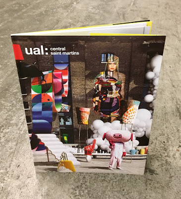
It was great to hear that Boyle & Perks won the Gold Award for the best specialist institution prospectus for their Guide to Central Saint Martins School of Art and Design.
The Judges comments are: “This entry pushed the boundaries of the genre effortlessly. The outstanding use of visuals conveys excitement and remains true to its brand throughout. An outstanding submission, well -written with a clear plan, well -executed and with strong ROI outcomes. Top work – others can learn much from it, the team should be very proud" 

I wrote about the previous year's prospectus, which featured Astralux on the cover HERE:
Design is by Boyle & Perks and congratulations on getting well deserved recognition for creating another excellent CSM prospectus. You can see all the winners HERE.

Posted by Justin Hobson 26.11.2020

Tuesday 24 November 2020

New Sarah Boris artworks

Some news, hot off the press today...

Harvey Lloyd Screenprint is a silkscreen print studio based in the South East of England and their work has appeared on this blog many times over the years. Established 40 years ago, they produce work for some of the best names in the industry, Harvey Lloyd have gained a reputation for having artists at their studio and working together to produce their artworks.

There are two new prints which are the result of their collaboration with artist and graphic designer Sarah Boris, One Step and Clover and here they are being printed...

Clover is printed in 4 colours and One step is printed in 3 colours. The size of both prints is 400mm square and here are the finished prints...
Click on images to enlarge
Each of the prints is numbered and signed by Sarah.
...and of course I must mention that they are printed on our wonderful Matrisse 250gsm, which is an uncoated, white board range with a high bulk (330microns) is FSC certified and Acid Free. These beautiful prints are available directly from their online shop HERE 

Posted by Justin Hobson 24.112020