Monday, 27 May 2019

Shiro Echo is 100% Recycled Paper

Many readers will know of our lovely range of ecological papers from Favini called SHIRO. Favini is a paper manufacturer based in Italy with mills in Vicenza near the city of Venice and at Crusinallo. They have taken a lead in the utlisation of non wood pulps since the early 1990’s and they are the manufacturers of the SHIRO range.
With the demise of the ArjoWiggins recycled mills and with it the products Cyclus and Cocoon, many printers and designers have been turning to Shiro Echo as an alternative.
Shiro Echo is available in two shades; there is a white shade (which is a natural/off white) and similar to the old shade of Cyclus and a Bright White shade which is similar to the old Cocoon. It is 100% Recycled and also carries the FSC Recycled classification.
As you can see from the image below, we have good stock availability in the UK, in fact many, many tonnes!

You can see the range here.

If you would like a swatch, please email me Justin@fennerpaper.co.uk
Posted by Justin Hobson 27.05.2019

Friday, 24 May 2019

Women's World Cup 2019...

Following the success of the Typographic Wallchart that we produced for the last years World Cup, we have now produced a new wallchart for an even more important event - the Women's World Cup!
This A1 size typographic wallchart is very simply produced in just two colour offset litho and is printed on our new Creative Print, Diamond 90gsm from German paper manufacturer Euler and is made using 100% recycled fibres..
Click on images to enlarge
To accompany the wallchart, we have produced a ready made "sweepstake kit" so that studios can easily run a sweepstake and get everyone involved - the sweepstake idea came about at the suggestion of our friends at Carter Studio - an excellent thought and our thanks to Joe and Phil.
Design of the wallchart and sweepstake kit is by David Coates, who also happens to be a member of the ISTD board (International Society of Typographic Designers) and my thanks to Dave for making it all happen - a perfect way to combine his love of type and football! Printing is by Typecast Colour in Paddock Wood.

We will be sending out some of these wallcharts in the post, but if you want to make absolutely sure you get a copy, you can email me Justin@fennerpaper.co.uk

Posted by Justin Hobson 24.05.2019

Thursday, 23 May 2019

Set in Stone

Yesterday evening I was at the St Brides Foundation in London for the launch of a wonderful notebook titled "Set in Stone". The project was a collaboration between design agency Carter Wong, printer Boss Print and us! This is the fifth notebook in the series, each one with a different and equally fascinating subject!

This edition showcases the fascinating examples of Jurassic fossils which can be seen all across London and its buildings.

The evening started with lashings of beer and wine and the opportunity to look at the exhibition showing the concept and the images that are the subject of the book.
There was then an introduction to the project by Sarah Turner, Managing Director of Carter Wong followed by a short presentation by Fenton Smith from Boss Print. There were over 100 people who attended....
...and here is the actual notebook that was the centre of attention.
The wonderfully debossed cover is on a vinyl based cover material. Flexible, durable and just right for a notebook.
...a birds eye view showing the binding and the pages with the images of the tiles printed, which are "french folded"
The below image shows a spread of the notebook with the image page on the left, showing the building and on the reverse side of the French folded image sections is an image of the stone/concrete that includes the fossils.
- what you cannot see and is impossible to show/photograph is the way that all the fossils are embellished, either with the most superb embossing, so they are actually in relief - a truly amazing effect or the most amazing foiling...
Above is the most amazing relief deboss and below is incredible foiling, which just brings the image alive...
The paper used in the books is our Redeem 100% Recycled 80gsm for the text pages and Omnia 120gsm for the fossil pages. The text pages printed on the Redeem are all printed with a solid tint which increases in tint as it goes through the book, representing the strata of rock.
Omnia is the perfect material to use for the Text pages as it's dead flat mattness gives incredible tactility to the fossil images, whilst still reproducing the images of the buildings superbly.
Printing is all offset litho. Embossing and foiling is all by Boss print and it is all to an exceptionally high standard.
 
A big thank you to Carter Wong, Boss Print and of course, our friends at the St Brides Foundation who made the event special as always.

http://www.carterwongdesign.com/
https://www.bossprint.com/
http://www.sbf.org.uk/
Posted by Justin Hobson on 23.05.2019 

Tuesday, 21 May 2019

Sun and Sea: Marina

La Biennale di Venezia was founded in 1895 and it is now one of the most famous and prestigious cultural organizations in the world. The 58th International Art Exhibition, titled May You Live In Interesting Times, takes place from 11th May to 24th November 2019. The title is a phrase of English invention that has long been mistakenly cited as an ancient Chinese curse that invokes periods of uncertainty, crisis and turmoil; "interesting times", exactly as the ones we live in today. The 58th Exhibition is curated by Ralph Rugoff, currently the director of the Hayward Gallery in London.

This is a project produced for the Lithuanian Pavilion, which has been awarded the golden lion (which is first prize) at the Art Biennale. The Pavilion features an Opera which lasts around an hour and this is the supporting collateral.
The production incorporates a record, record sleeve and a booklet/libretto containing the lyrics of the songs which you can hear during the performance together with other text about the artists and the curators of the pavilion.
Click on images to enlarge
The 32pp libretto is printed on Offenbach Bible 60gsm. The size is 305x310mm and is printed offset litho in three colours both sides, two blacks and a Pantone special Gold. As you can see from the images the Offenbach Bible has printed the solid gold metallic superbly and the paper flops and folds beautifully in the hand.
The record sleeve is printed 5/5 colors onto Arktika Paper (from Papyrus) 350gsm. On the front side (the stripes) the sleeve has been screenprinted by inmates of the male prison of Venice - in the Venetian jail there is a screen print workshop and it was printed by the prisoners with help from the workshop staff. You can read more about the Prison and their work: https://malefattevenezia.it/en/a-great-value/a-great-team/

You can read more about the Lithuanian Pavilion here....
Sun and Sea: (Marina)
We look down from a minstrel’s gallery on the holiday-makers below, kids building sandcastles, tourists sunning themselves on towels, oiling up and eating ices. An almost hour-long opera – the work of theatre director Rugilė Barzdžiukaitė, playwright Vaiva Grainytė, and composer Lina Lapelytė – this seductive performance is beautifully sung by the lounging tourists as we watch from our balcony, our ticket to the end of the world. Threat slowly seeps in, like sun-tan oil. A lament to the eclipse of the world, as the sky and sea change colour, the reefs bleach and nature dies, this astonishing performance slides into almost unbearable pathos and pain. I can’t stop thinking about this work, which rightly won Lithuania the Golden Lion for best pavilion. Flying in and out, and living the way we do, we are all implicated. Not interesting times, but the last days.

You can watch and hear a minute or two of the Opera here (https://vimeo.com/320379708)
The printing of the Offenbach Bible and the colourwork on the sleeve is all by Grafiche Veneziane, who are a printing company based right in the centre of Venice - yes really, the factory is in an ancient building surrounded by canals and the paper (and everything else) has to be delivered by boat! Below is a picture of the team around the project, which they are justly proud.
The entire product (sleeve+booklet+record) is published by SKIRA. Concept and design is by Åbäke.

You can read more here on The Guardian website:
https://www.theguardian.com/artanddesign/2019/may/12/mawkish-monuments-beach-from-hell-our-verdict-venice-biennale

My thanks to Dr. Filippo Ranchio at Grafiche Veneziane for giving me all the details about the project.
Posted by Justin Hobson 21.05.2019 

Monday, 20 May 2019

The 5th Wayzgoose at the St Bride Foundation

Yesterday, I had a stall at the St Bride Foundation WAYZGOOSE. This is a term (unfamiliar to most people) that used to refer to an annual holiday in a print-works and was often an awayday to the coast or some other sort of day out, more often than not, paid for by the firm. In this instance the St Bride Wayzgoose is a kind of letterpress 'bring and buy' sale.
Thirty tables displaying and selling many different items - everything from lead type to the Adana tabletop presses from Caslon, to secondhand books and printed examples of work.
Below is the table that I was allocated, where, as with previous years, I adopted a "throw it all on the table" approach! I took lots of offcuts and discontinued paper and board items. All paper and card sold by weight - 30 pence per 100 grams.
I served at my 'paper stall' from 11am to 4pm  ...and by the end of the day I had raised a record breaking £357.00, all donated to the St Bride Foundation.
...and here is my beautifully crafted 'Weigh & Pay' signage.by Helen Ingham from the Hi Artz Press - It's now lasted two wayzgooses!
My thanks to Mick Clayton for organising the event and to all the staff and friends at St Bride's.

http://www.sbf.org.uk/
Posted by Justin Hobson 20.05.2019

Wednesday, 15 May 2019

CSM Guide 2019

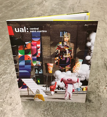
I've written many posts on this blog which includes the phrase "...just the cover makes the difference!" The cover on this prospectus is simply perfect. It is printed on our Astralux, One sided 170gsm, with an amazing image which is a photo composition of 28 works by CSM students,  all laid out with the wonderful King's Cross building as the backdrop.
Click on images to enlarge
The size of the publication is 270x200mm, portrait. The cover has 100mm flaps, which you can see in the birds eye picture below...
The below image shows the opening spread, which shows the 92pp text, which is stepped and printed on a combination of recycled uncoated, gloss art and yellow tinted paper.
Above you can see the way the image wraps around the cover over to the flap - and this is where the real magic happens, because Astralux being a 'Cast Coated' paper it has a high gloss surface one side and is uncoated on the reverse, so you get the juxtaposition of the high gloss coated with the toothy uncoated reverse (printed yellow) as I hope you will be able to see in the image below...
The image below shows the cover in it's entirety, spread out
Click on images to enlarge
The job is PUR bound - a very neat job.
It is a superbly designed piece of literature which has to engage with young creative minds, demonstrate that CSM is a world class arts and design college whilst also satisfying the CSM Alumni! No easy task. Design is by Boyle & Perks.

The excellent print is by Pureprint. It is printed offset Litho throughout in CMYK plus the bright yellow printed as a pantone special.

https://www.arts.ac.uk/colleges/central-saint-martins
http://boyleperks.com/
https://www.pureprint.com/
http://www.favini.co.uk/
Posted by Justin Hobson 15.05.2019

Friday, 10 May 2019

Now Try Something WEIRDER

Yesterday evening I was lucky enough to be invited to the book launch of Michael Johnson's new book: Now Try Something WEIRDER. The launch was at the Johnson Banks studio in Clapham and there were lots of people, drinks and yummy food too.
This is Michael's third book, the others being Problem Solved and Branding in Five and a Half steps, which are both weighty books which have since become required reading amongst design students. Michael spoke about how this book had come about and how this one had been a lot more fun to write!
 ...and there was the opportunity to buy a copy of the book too!
  Thanks to all at JB for a great evening.

...and don't forget to buy the book, which you can do right here:
https://www.laurenceking.com/product/now-try-something-weirder/

http://johnsonbanks.co.uk/
Posted by Justin Hobson 10.05.2019