Friday, 5 July 2019

HUMAN \

Graphic artist, print-maker and designer Anthony Burrill, has paired with Rosie GarcÍa founder of HUMAN \ to create these original and limited edition letterpress prints.
The HUMAN TOGETHER, TOGETHER HUMAN prints are an exclusive run with 100% of the profit going to Young Minds Mental Health Charity.

In 2017 Rosie GarcÍa founded HUMAN \ to promote the conversation around Mental Health Awareness. HUMAN \ works with artists to create limited edition pieces and bespoke garments, while donating part of every sale to Young Minds Mental Health Charity.
Anthony has made a reputation in the design world by using bold text-based compositions to convey meaningful and persuasive messaging. Having met in 2018 while working on another project to raise money for Shelter, the pair struck up a friendship.
Anthony spent a day guiding Rosie through the process and precision of letterpress printing at the well-known Adam’s of Rye, along with Ian and Derek who set and printed the wood type prints using traditional letterpress techniques.
 ...and here's a plug for the paper!
The prints are printed onto our new shade, Colorset Blush 270gsm and they look superb...
 Product shots by Liz Seabrook.

You can buy the prints here: https://human-human.myshopify.com/

http://anthonyburrill.com/
http://www.adamsofrye.co.uk/
Posted by Justin Hobson 05.07.2019

Tuesday, 2 July 2019

Jobs from the past - Number 117

Regular followers of this blog will know that my first post of every month is a "job from the past" so that I can show some of the really good work from years gone by - this project is from 2013.

Keith Coventry - Twentieth Century Estates 2013
In 2013, Modern Collections brought together the most comprehensive exhibition of Keith Coventry's 'Estate Paintings' ever staged. At first these paintings appear to be abstract or lost Russian Suprematist paintings but in fact turn out to be maps of housing estates. An essay by Owen Hatherly interprets the work and places it in context of the 20th century.
This is the exhibition catalogue which is A5 (210x148mm) portrait. It has a 4pp cover and 68pp text and the contents include a foreword by Orlando Whitfield, the essay and then images of the works. The 4pp cover is printed in a solid green on our Colorset White 270gsm which is an uncoated board with an antique feel. The text is printed on Omnia White 120gsm.
Click on images to enlarge
Images showing the works hung in the gallery....
The below image shows the majority of pages, image on right hand side only.
Click on images to enlarge
 Inside back spread...
 ...So what is it exactly that is special about this job? Colorset was chosen instead of the other well known coloured text and cover range because it would save money but most importantly print a solid colour superbly, which it did. Omnia was chosen for the text pages because a coated paper would have had the wrong aesthetic for the work, which required an uncoated look. However the shadows in the images have a subtle vignette which on a 'normal' uncoated would lose all the detail but on Omnia it graduates in a crisp even, subtle way and looks great, as I hope you can see in the image below....
Design is By Jon Gray at Gray318. Printing was by Paul Martin at Jigsaw Colour printers, based in Bermondsey in South London.

A superb example of an art catalogue.

http://keithcoventry.com/artworks/estate-paintings
http://gray318.com/
http://www.jigsawcolour.co.uk/
Posted by Justin Hobson 02.07.2019

Thursday, 27 June 2019

The Monocle Shop

Monocle is a premium mediabrand with print, audio and online elements, not to mention their ever expanding retail network and on-line business. The Monocle Shop is at street level in six cities - London, Zurich, Merano, Hong Kong, Tokyo and Toronto. The shop keeps everything from luggage and clothes to stationery and furniture.
This piece of promotional literature shows what is available at the shop. The finished size is 216x102mm, portrait and is a 16pp folded format folding out to a flat size of 402x432mm.
The above folds out to reveal the first spread below...
 ...and then folding out again, left and right.
Click on images to enlarge
 and then folding up to reveal the full spread below.
The whole publication is all printed offset litho on our Offenbach Bible 60gsm ...and it looks and feels absolutely gorgeous - it flops and folds in a delightful way when handling the publication as I hope these images demonstrate. The below image shows the way it folds.
The below image shows both sides.
 The print quality is superb as I hope the below image demonstrates.
Click on images to enlarge
Design is by Loi Xuan Ly at Monocle. The publication is printed offset litho, CMYK throughout. The excellent print is by Park Communications, who are based in East London,

https://monocle.com/shop/
https://www.parkcom.co.uk/
Posted by Justin Hobson 27.06.2019

Tuesday, 25 June 2019

Charles Hotel - Munich

Set within the verdant Lenbachgärten quarter and close to the historic Königsplatz, the effortlessly elegant Charles Hotel in Munich is where contemporary style meets traditional Bavarian hospitality. Centrally located by the Alte Pinakothek and the Lenbachhaus, The Charles Hotel also enjoys the calm backdrop of the Old Botanical Garden. Built on the site of a former university library, the hotel was created in 2007 and named in honour of Sir Rocco Forte’s and Olga Polizzi’s father, renowned hotelier Charles Forte.

This the brochure for the hotel, which follows the new branding by Pentagram.
Size of the brochure is 266x204mm, portrait and is saddle stitched. The cover is an unusual format as there is an 8pp cover with 140mm wide flaps and there is an outer jacket, only 210mm high, also with 140mm flaps. It is the first time I've seen this combination and the effect is superb...
The materials used for the covers is our Dali range, which is a 'felt-marked' paper with a linear effect and a natural, tactile feel. If you click on the image below, you will be able to see the texture in the paper.
Click on images to enlarge
The cover is on Dali Nero 200gsm and is hot foil blocked in matt white and copper foil. The jacket is printed on Dali, Candido, 160gsm and is litho printed in CMYK on one side only.
The 16pp text is printed offset litho on our Marazion Ultra 135gsm, chosen because of it's dead matt flatness which would reproduce the interior images well without a glossiness which would detract from the classic look and feel of the hotel.
The brochure has a beautiful, quality feel and flows in the hand superbly. The combination of photography, materials and quality print makes this a wonderful piece of print.

https://www.pentagram.com/
https://www.gavinmartincolournet.co.uk/
Posted by Justin Hobson 25.06.2019

Friday, 21 June 2019

The Burlington Arcade

The Burlington Arcade in London dates back to 1819. Designed by Samuel Ware “for the sale of jewellery and fancy articles of fashionable demand, for the gratification of the public.” It was commissioned by Lord George Cavendish, Earl of Burlington and owner of the adjacent Burlington House, as a safe place for his wife and other genteel folk to shop. Today it continues that tradition, with a host of luxury shops.

"Just the cover makes the difference" is a phrase I've used many times on this blog about many projects where the cover "makes the difference" and this is just one of those projects. The cover is printed on one of our new Colorset shades - Charcoal in 350gsm.
Brochure size is 240x170mm, portrait. The outside cover is simply (but beautifully) hot foil blocked in a rose gold metallic foil - Foilco Ref 6037
There are some really nice features to this project. Firstly the brochure is encased in a bespoke envelope (250x180mm) made from the same material as the cover and is also hot foil blocked on the outside and a beautiful touch is the foiling on the inside of the flap. Quite an extensive area to foil but the Foilco Foil (6037) looks superb...
Another quality element is the three hole sewn binding, which is superbly done and holds the 16pp text securely in place. Identity Printers actually do this at their in-house bindery.
...and on the inside front and back covers the Burlington monogram is hot foil blocked in clear foil.
Detail showing the monogram
Just look at the precision of the scoring on the outside flap of the envelope. It gives the whole project a wonderful, quality feel.
Print and hot foiling is by Identity Print, based in Paddock Wood with Paul Martin handling the project.

https://www.burlingtonarcade.com/
http://www.identityprint.co.uk/
http://www.foilco.co.uk/
Posted by Justin Hobson 21.06.2019

Tuesday, 18 June 2019

World Cup Wallchart

Our Typographic Wallchart that we have produced for the Women's World Cup has been going down a storm with all you football fans out there

This A1 size typographic wallchart is very simply produced in just two colour offset litho and is printed on our new Creative Print, Diamond 90gsm from German paper manufacturer Euler and is made using 100% recycled fibres.

The wallchart has appeared on the Koehler website here

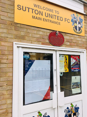
...and our wallchart has also had professional recognition! Below you can see the wallchart at Sutton United FC, where it is proudly displayed on the door and the bar
Design of the wallchart is by David Coates, who is also an ISTD (International Society of Typographic Designers) board member and my thanks to Dave for making it all happen - a perfect way to combine his love of type and football! Printing is by Typecast Colour in Paddock Wood.
 
We are now coming to the end of the group stages and the competition is really hotting up now. We have a few of the wallcharts left, so if you would like one, you can email me Justin@fennerpaper.co.uk
 
Posted by Justin Hobson 18.06.2019

Friday, 14 June 2019

The Burns Series

The Burns series is a range of greeting cards produced in Scotland by Solway Print who are based in Dumfries and Galloway. The cards feature quotations by Robert Burns accompanied by a small illustration. What makes these cards extra special is that they are printed letterpress.
Here are two cards from the series. The cards are 125mm square and are left blank on the inside. The outside of the cards is letterpress printed in 2 colours, black and deep red. Each of the cards has an explanatory note about each of the quotations on the reverse of the card.
Click on images to enlarge
The cards are printed on our Pure Cotton 350gsm, which is a range made using 100% cotton fibres. The board has a wonderful feel and prints letterpress superbly as cotton papers have a wonderful compressibility, allowing the type to sink into the paper (without having to crash/bash it!) You can see from the image below, just how good the crease works.
The cards are designed by Miranda Cloy who is a designer and illustrator at Solways. Many thanks to Miranda for giving these cards to my colleague Kerry and allowing them to be shown.

https://www.solwayprint.co.uk/
Posted by Justin Hobson 14.06.2019